Classic Negative film simulation recipe for a muted Fujicolor look
Nostalgic Fujicolor
Here’s a film recipe that uses the Classic Negative film simulation to give a versatile recipe for use in a wide variety of settings. It has a look that reminds me of Fujicolor film photos, thanks to the wonderfully retro tones of Classic Negative.
Characteristics of this film recipe are softened highlights, a warm colour balance and reduced saturation. It means that the overall recipe is quite subtle, producing mellow, film-like images without overpowering colour.
Nostalgic Fujicolor Film Recipe Settings
| Film Simulation | Classic Negative |
| Grain Effect | Weak, Small |
| Col. Chr. Effect | Off |
| Col. Chr. Blue | Weak |
| White Balance | Auto, +3 Red, ‑6 Blue |
| Dynamic Range | DR400 |
| Highlights | ‑1.5 |
| Shadows | 0.5 |
| Colour | ‑4 |
| Sharpness | 0 |
| ISO N.R. | ‑4 |
| Clarity | 0 |
| EV Comp. | +1/3 |
Similar Recipes

More similar recipes, and hundreds more exclusive looks, are available in the Film Recipes App.
Get the Film Recipes App
Filter by film simulation, mood, shooting condition and more


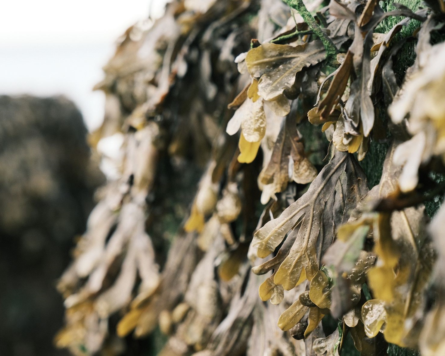
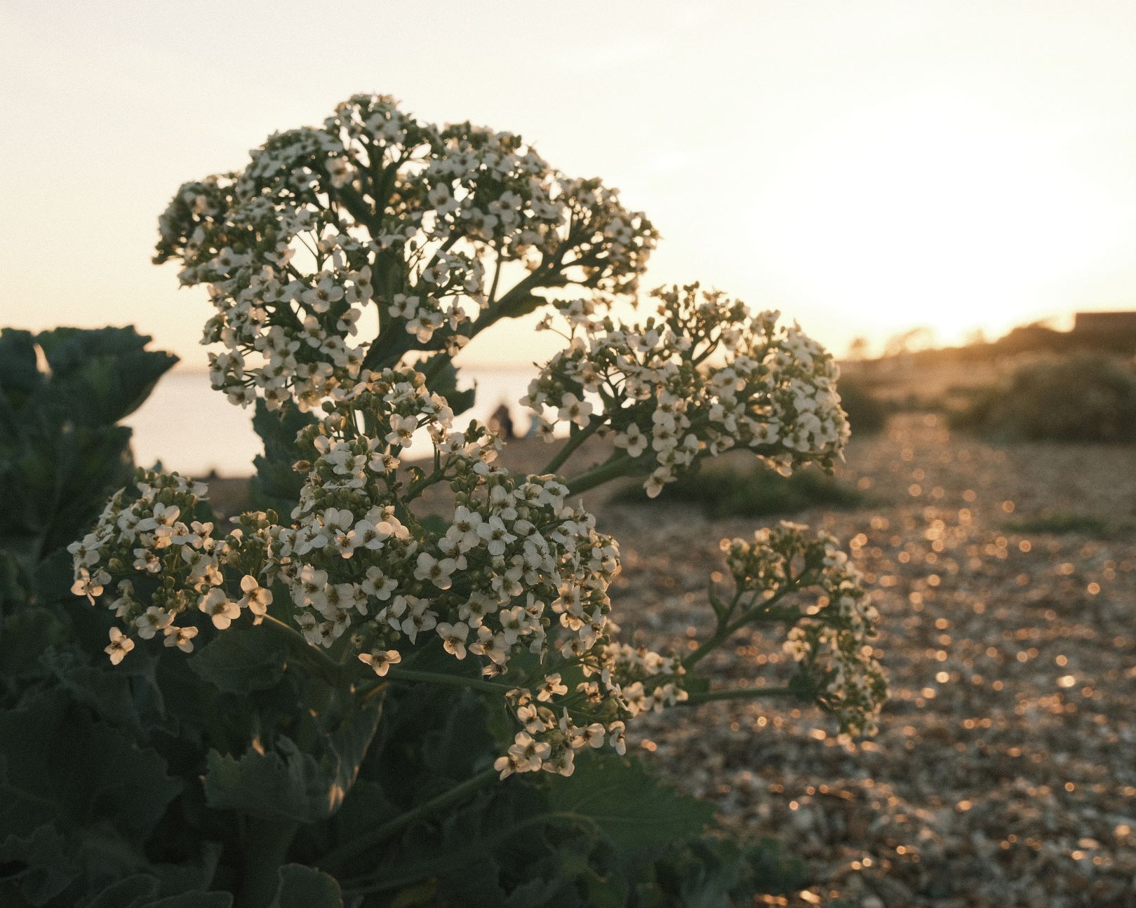
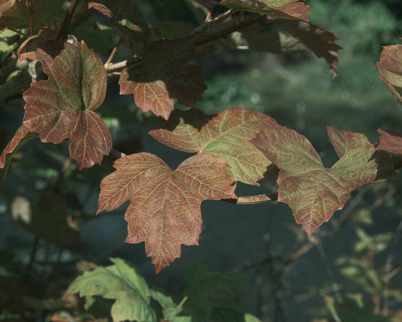
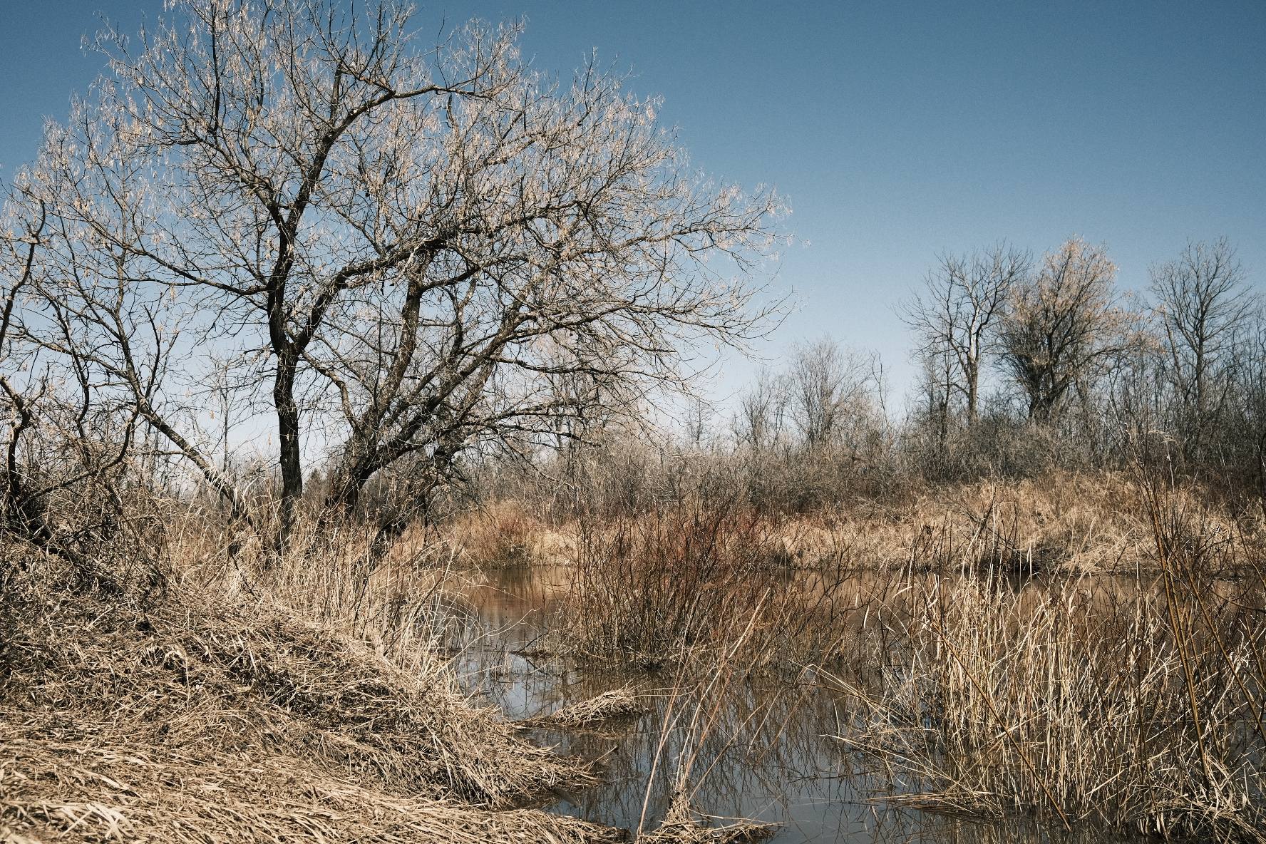
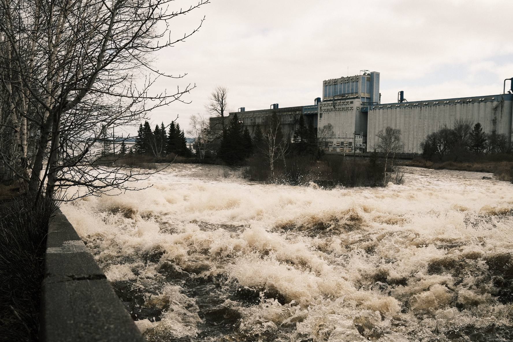
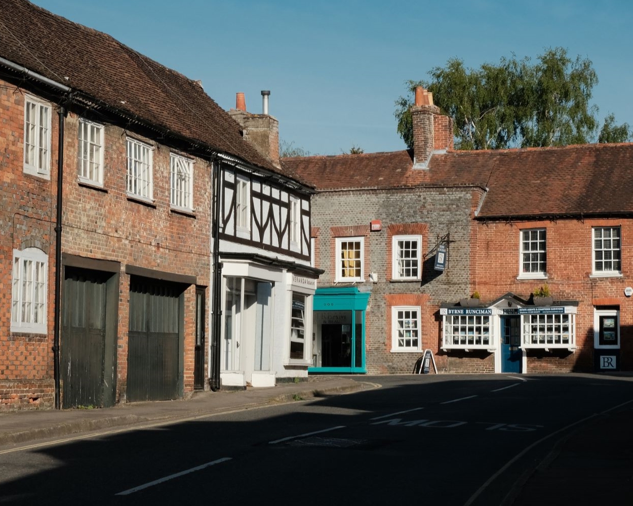
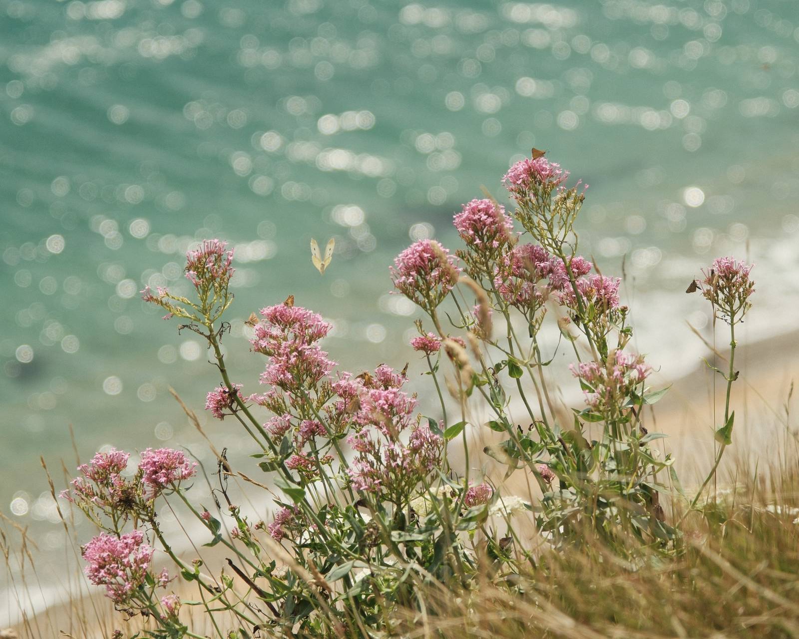
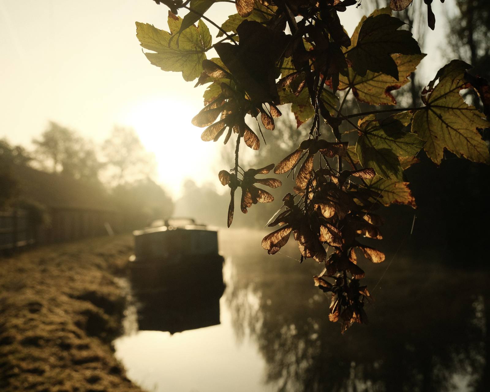
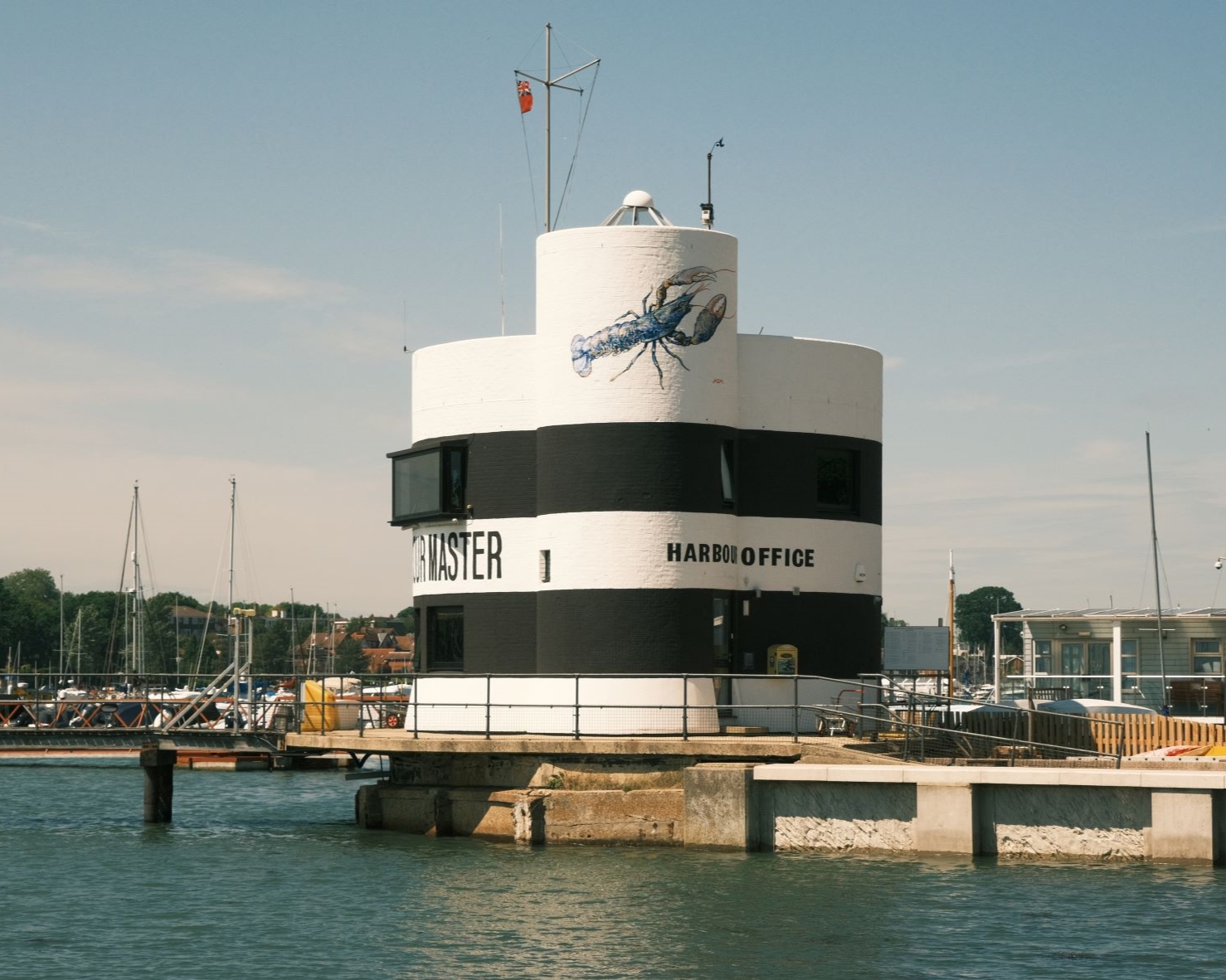
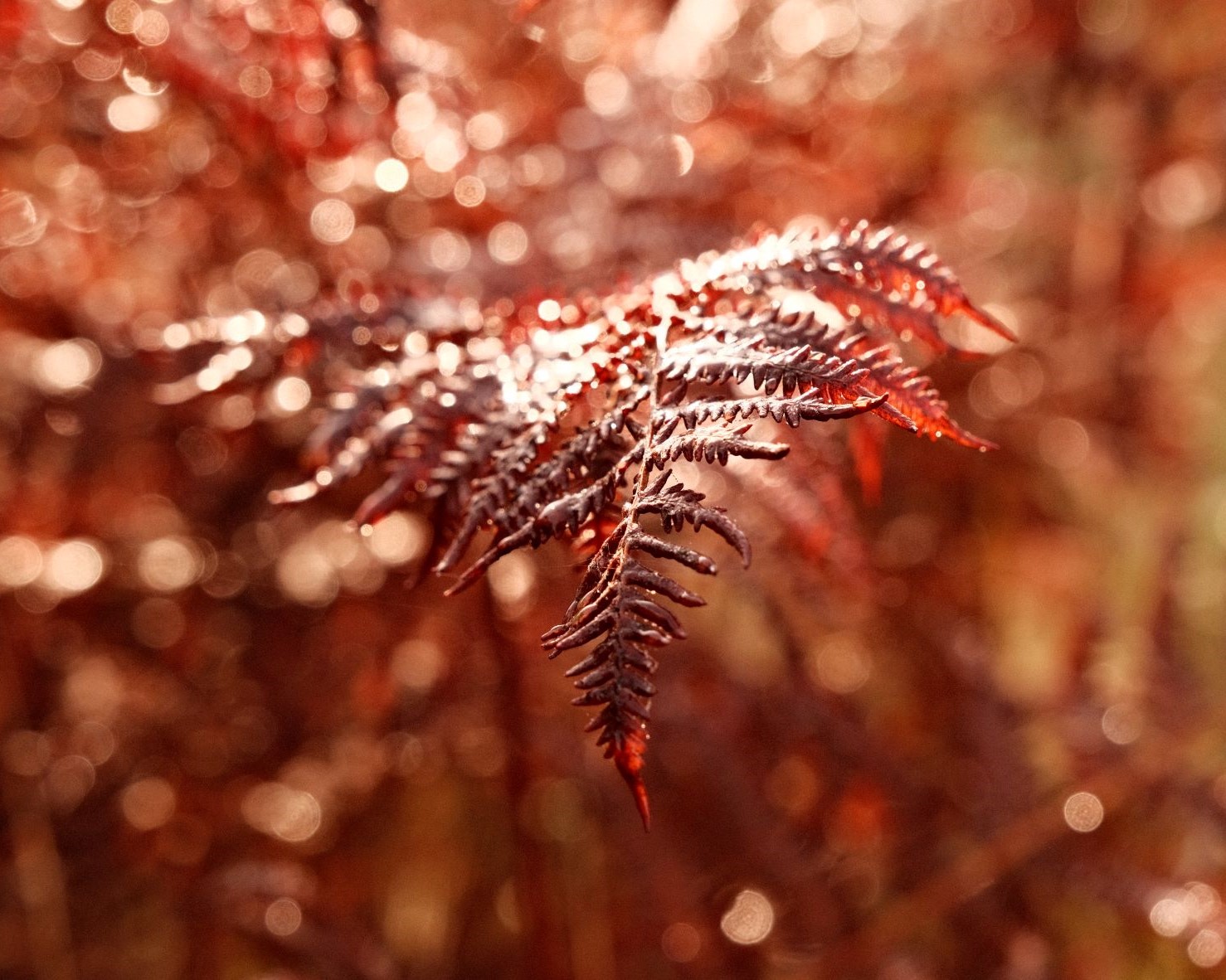
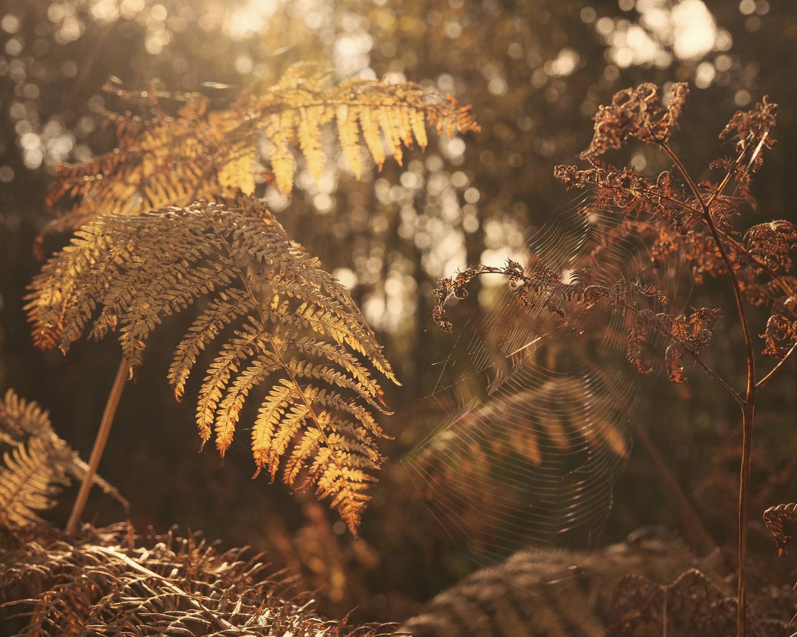
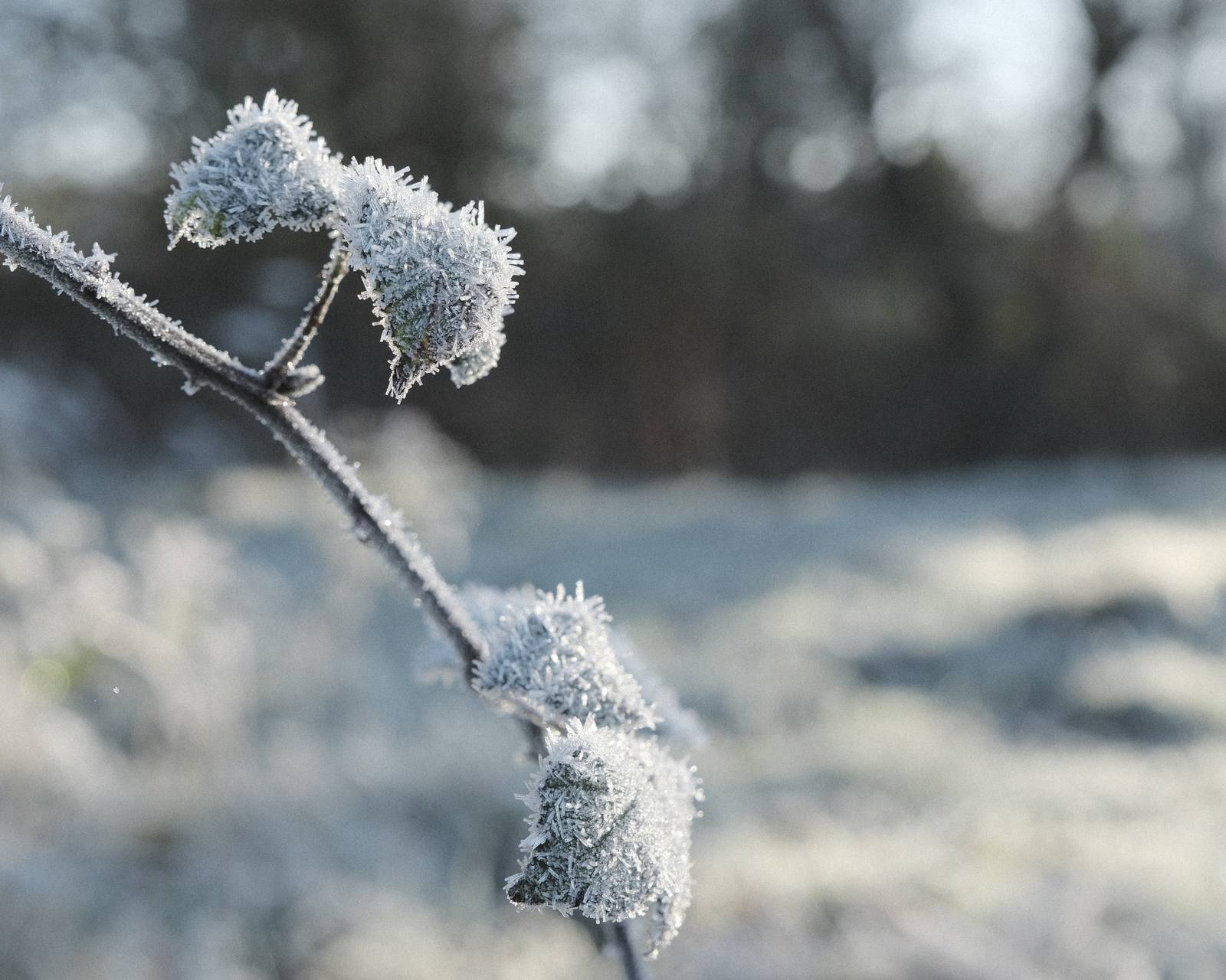
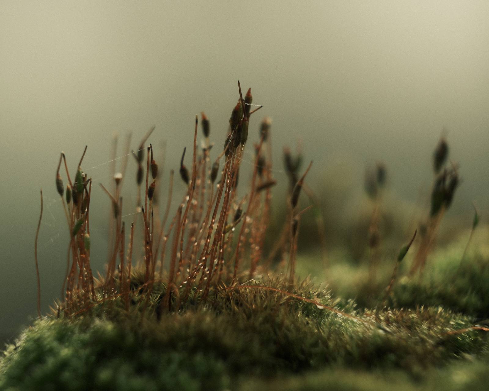
Nostalgic Fujicolor Film Recipe: Sample Photos
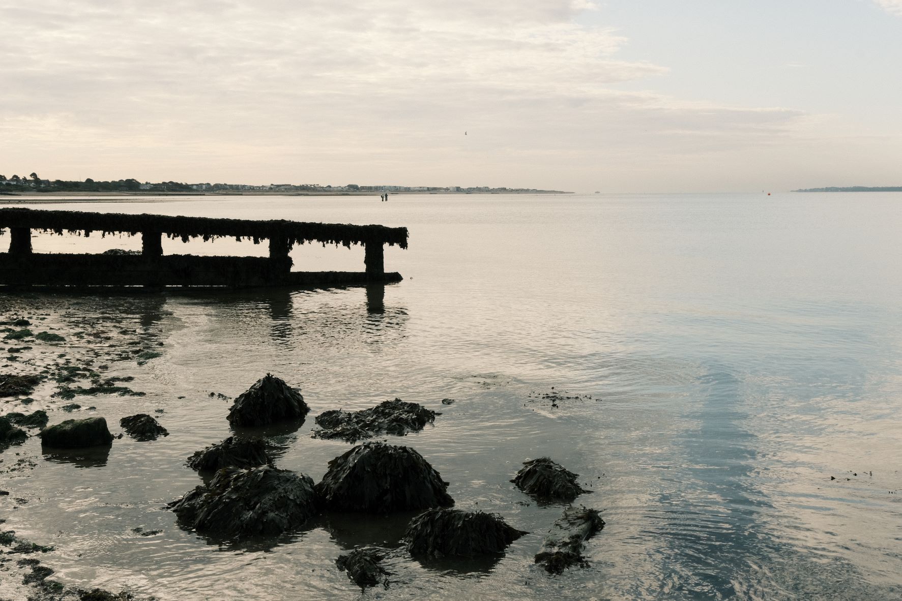
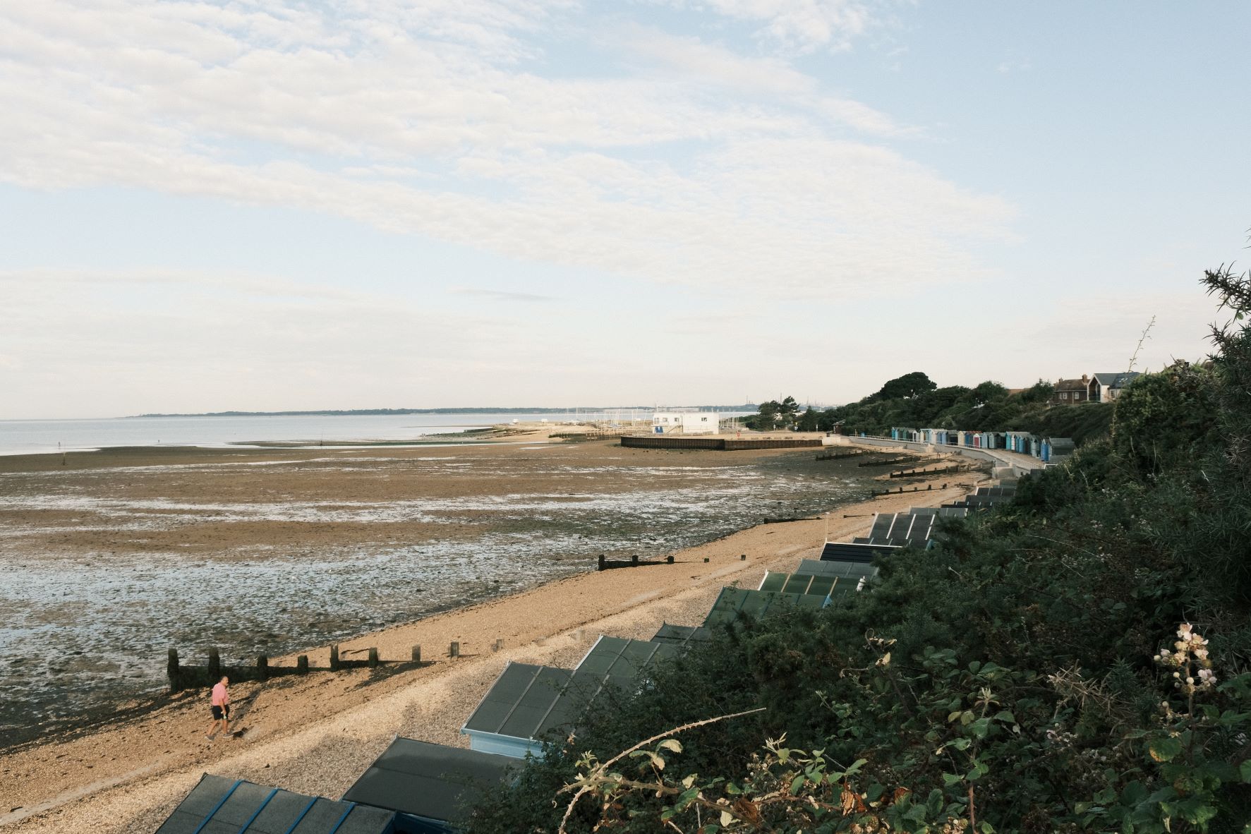
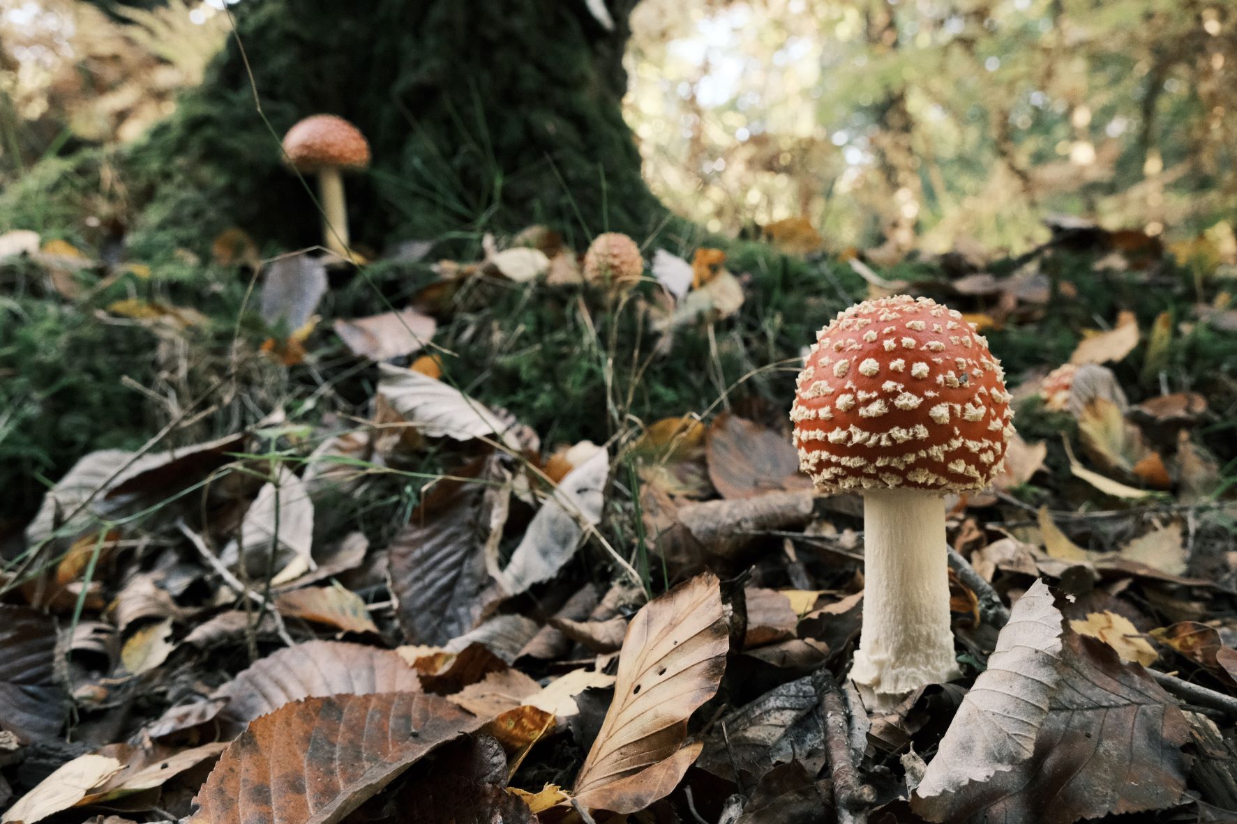
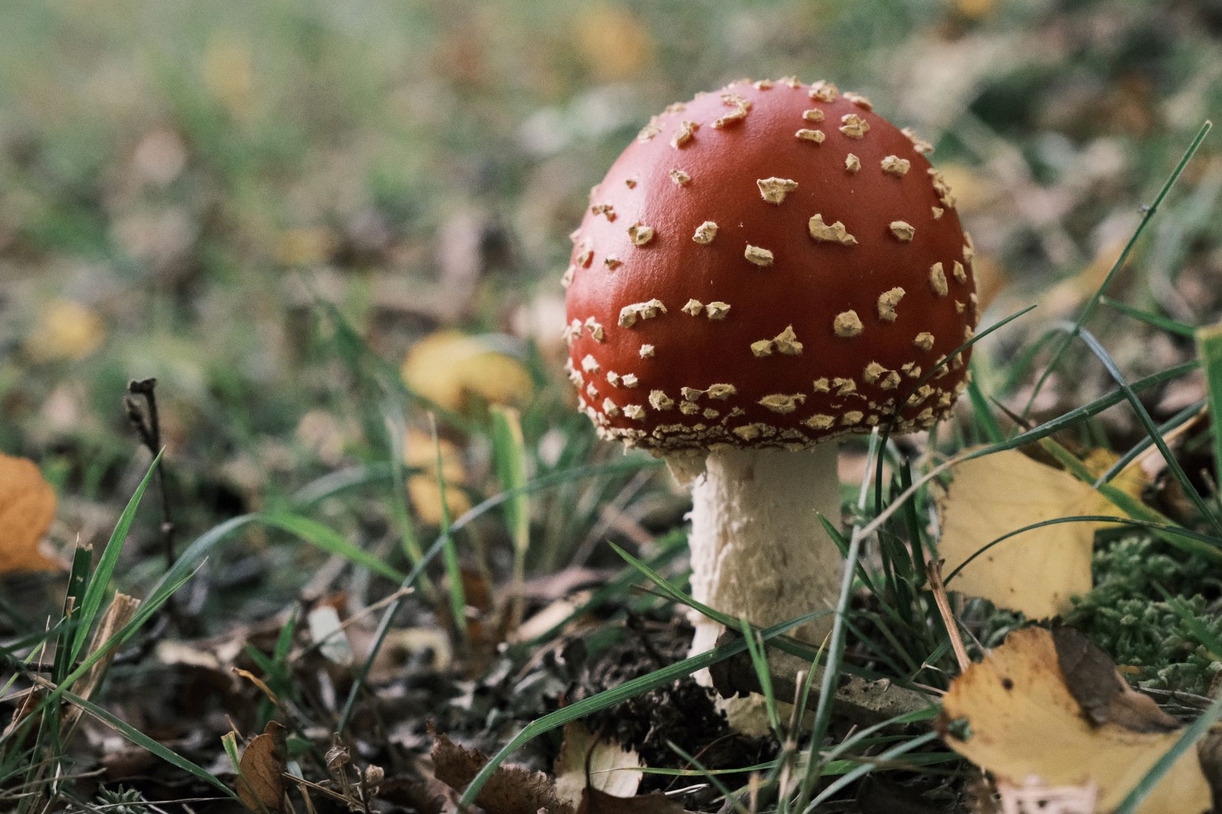
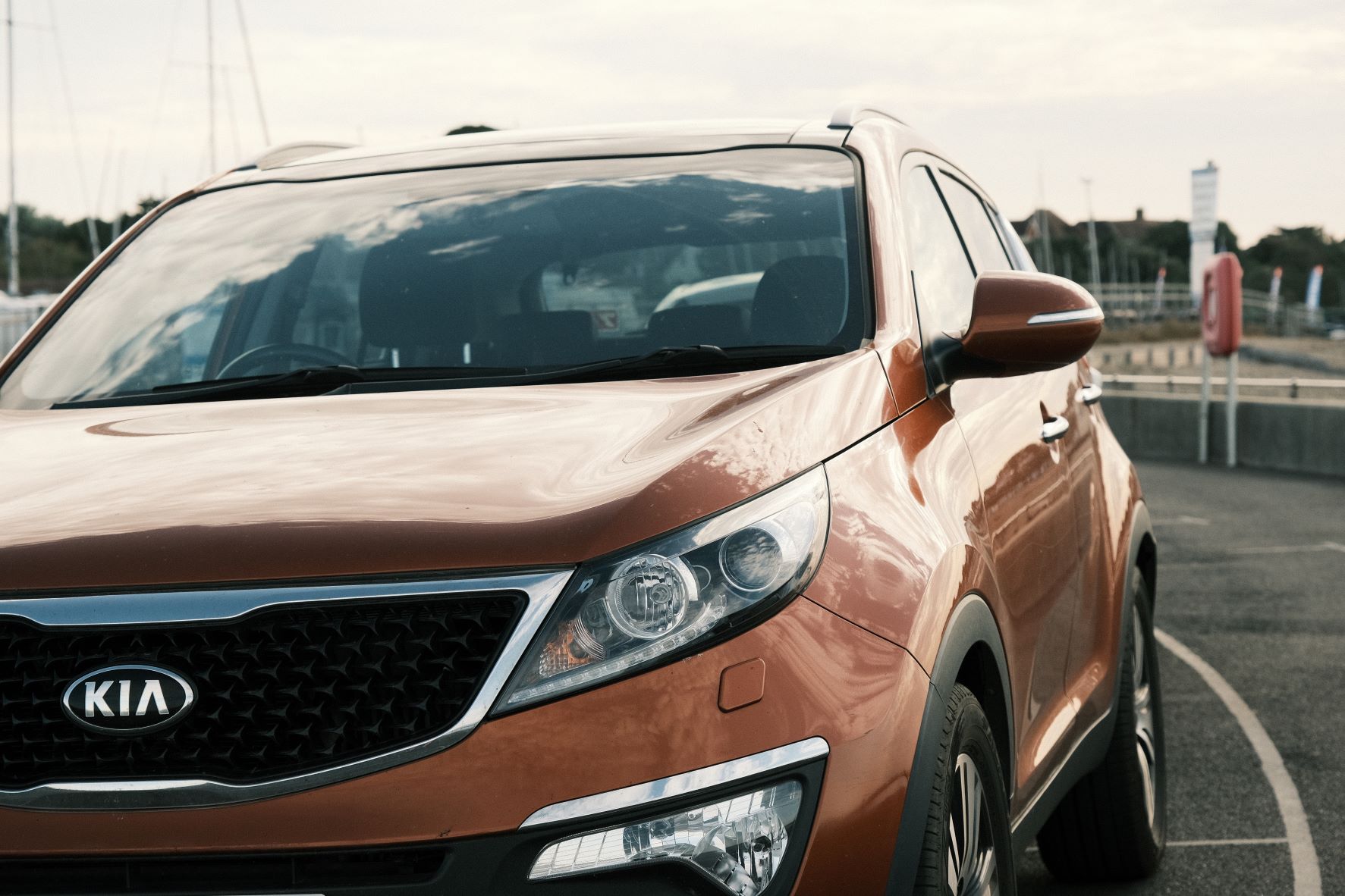
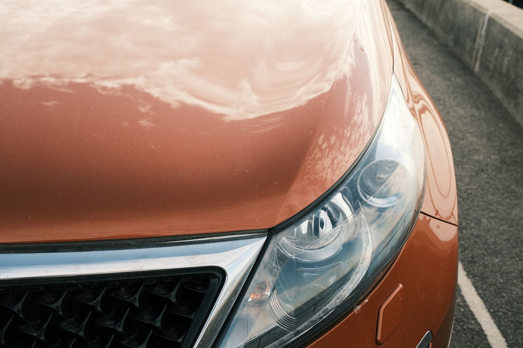
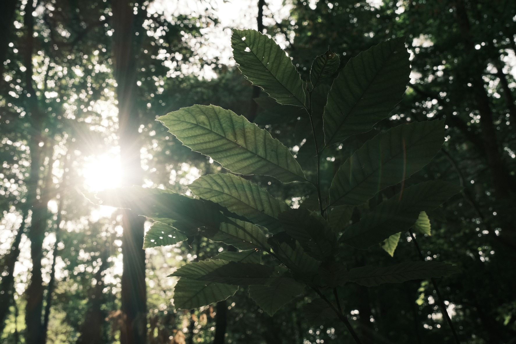
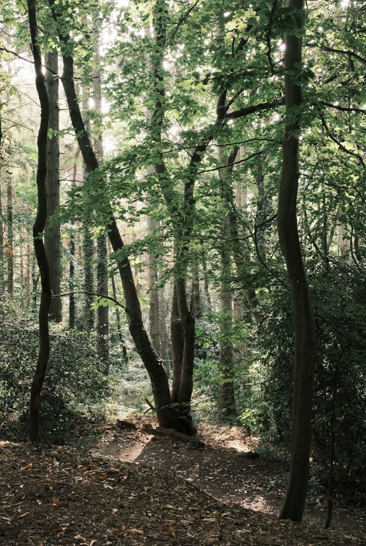
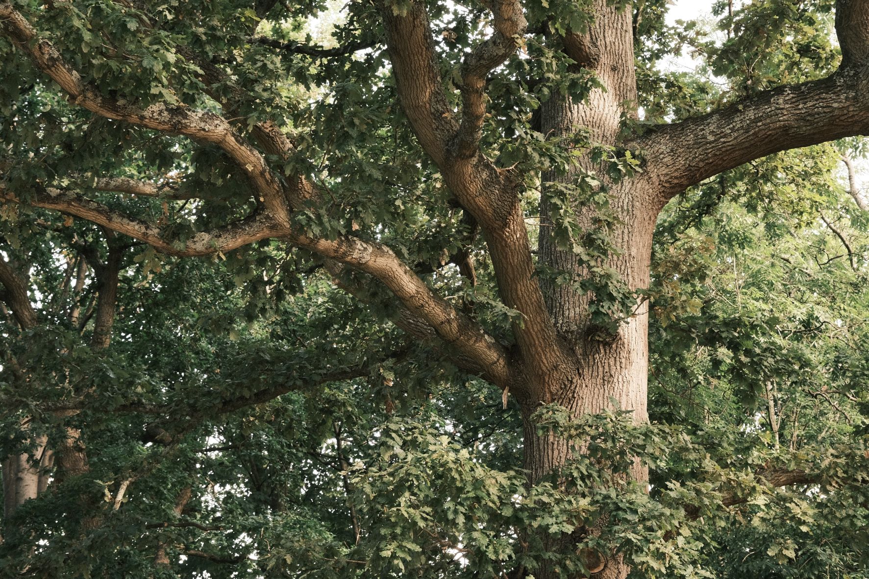

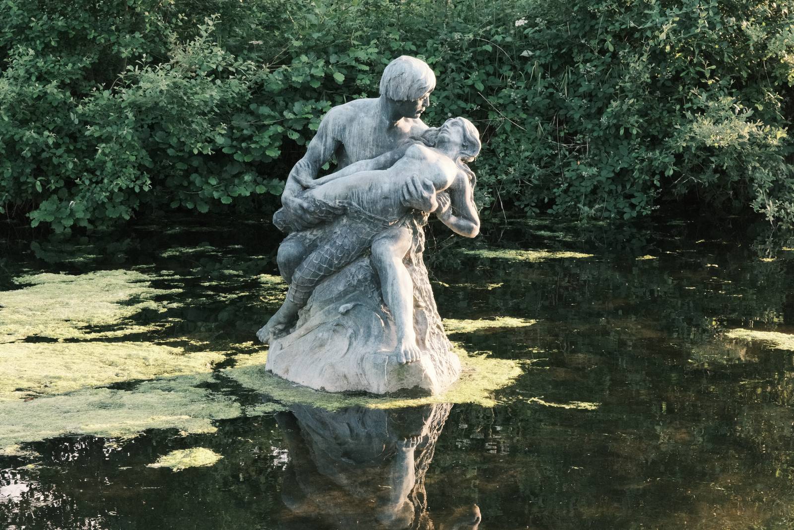
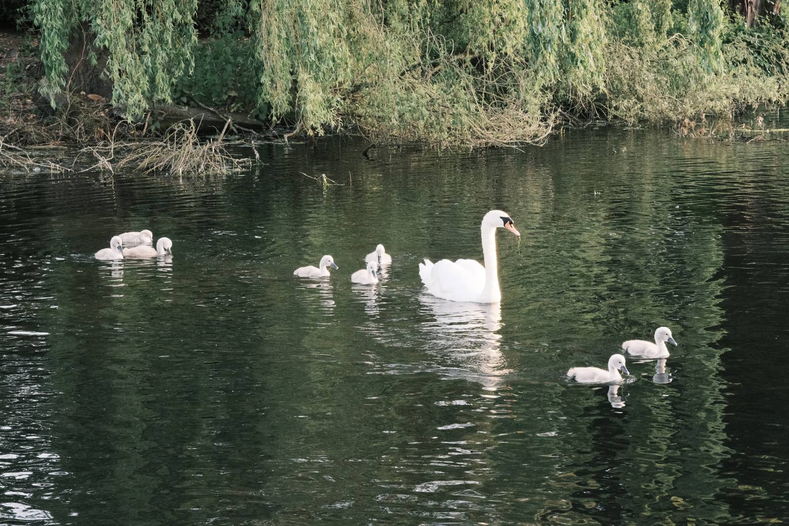
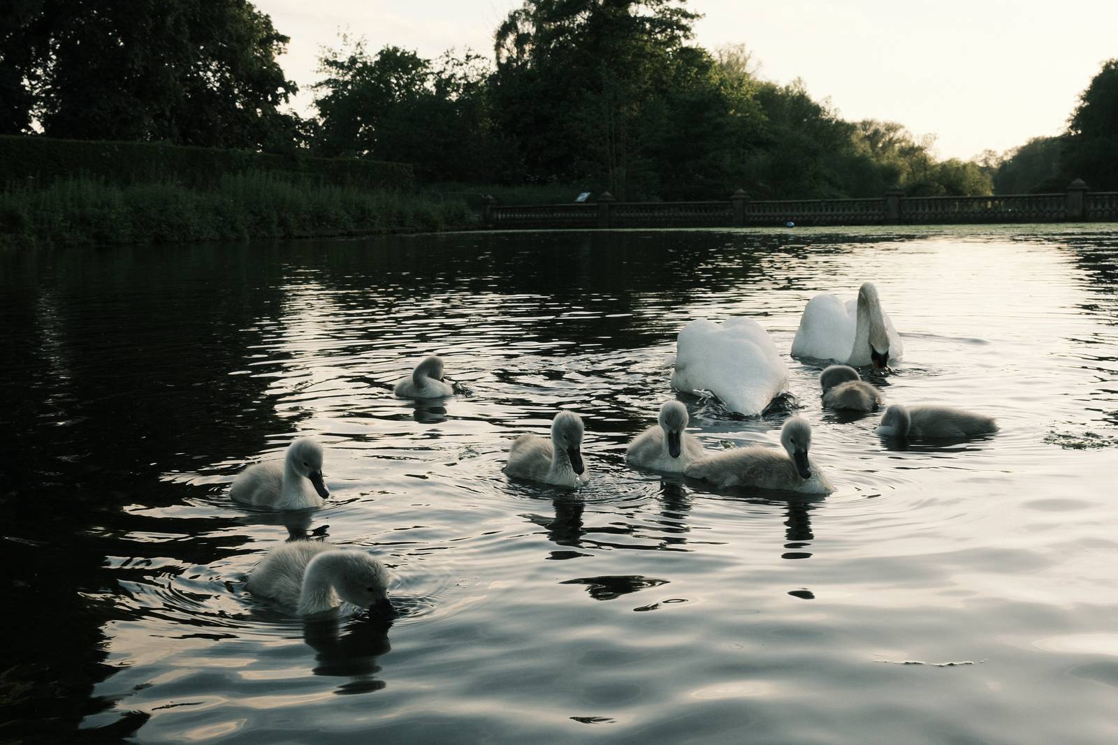

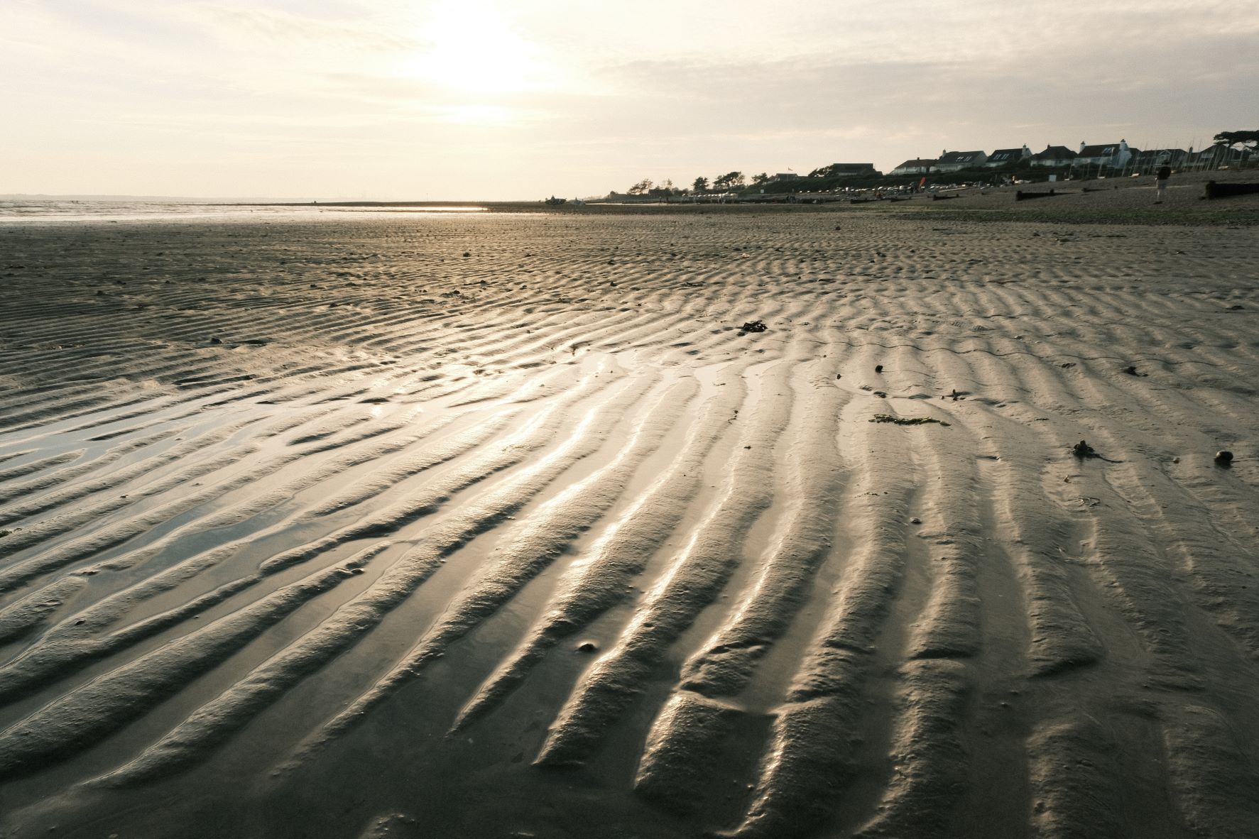
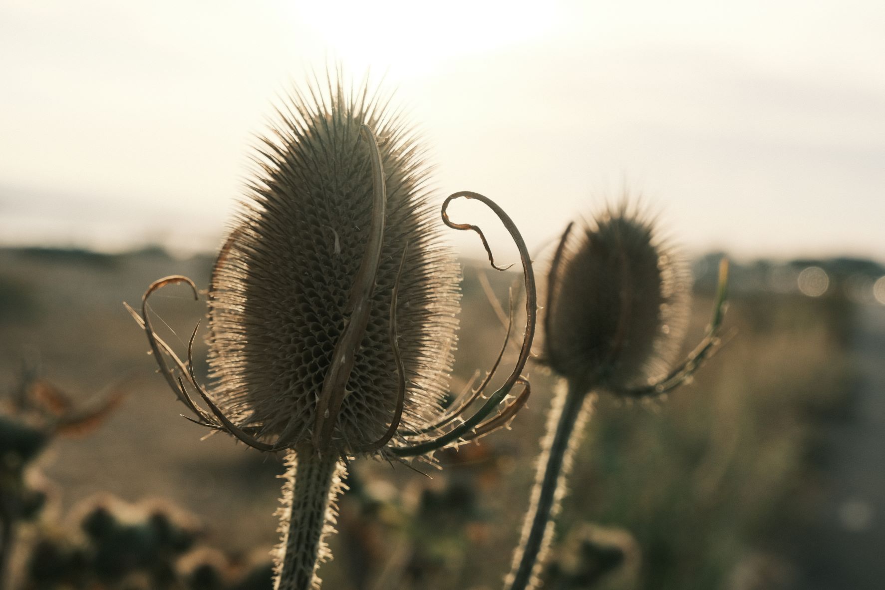

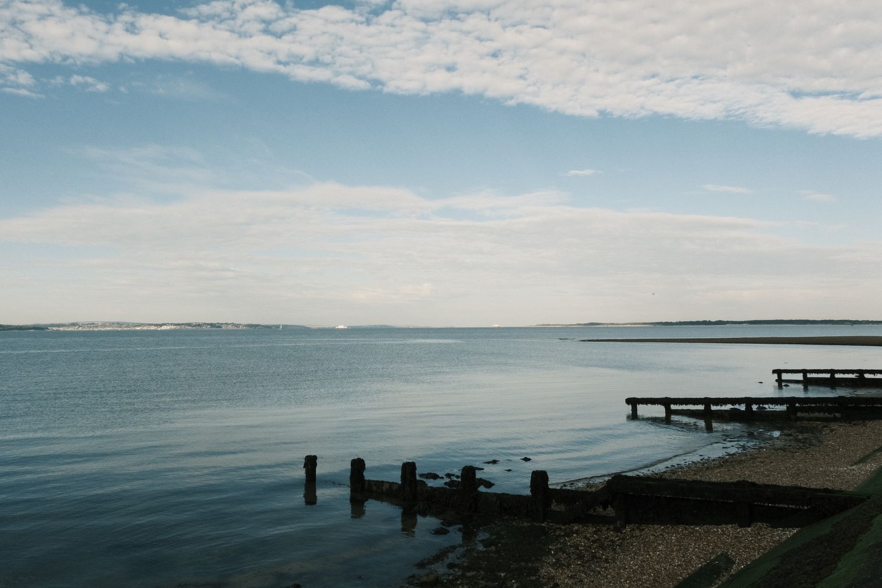


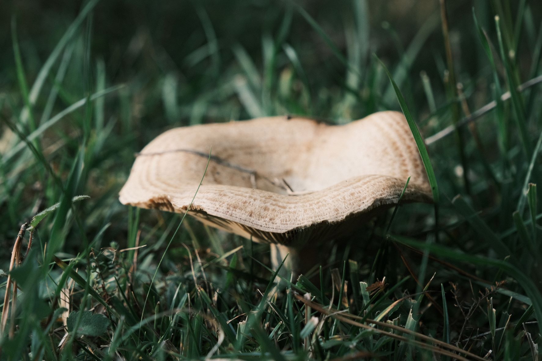
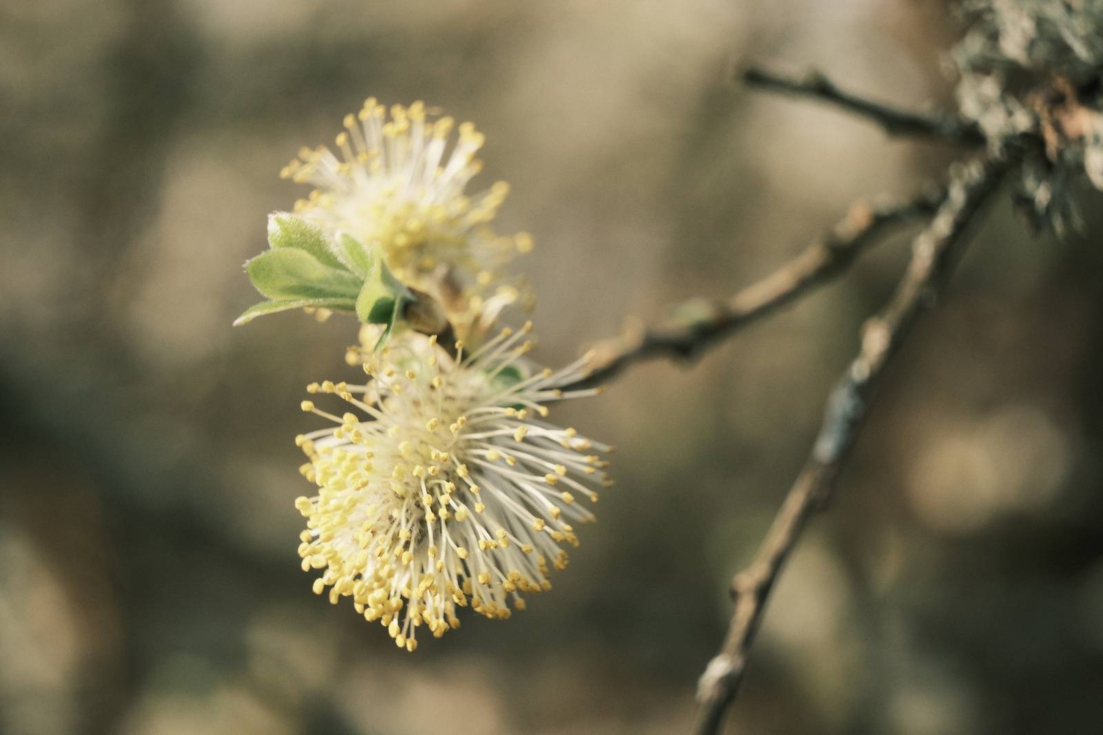
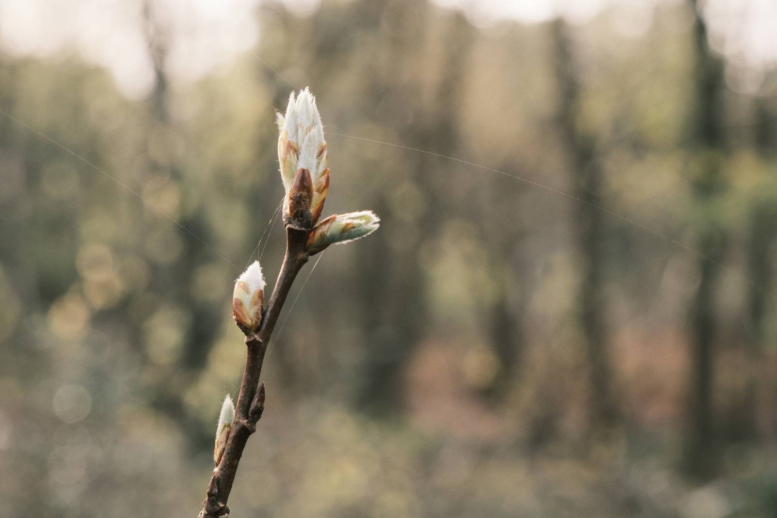

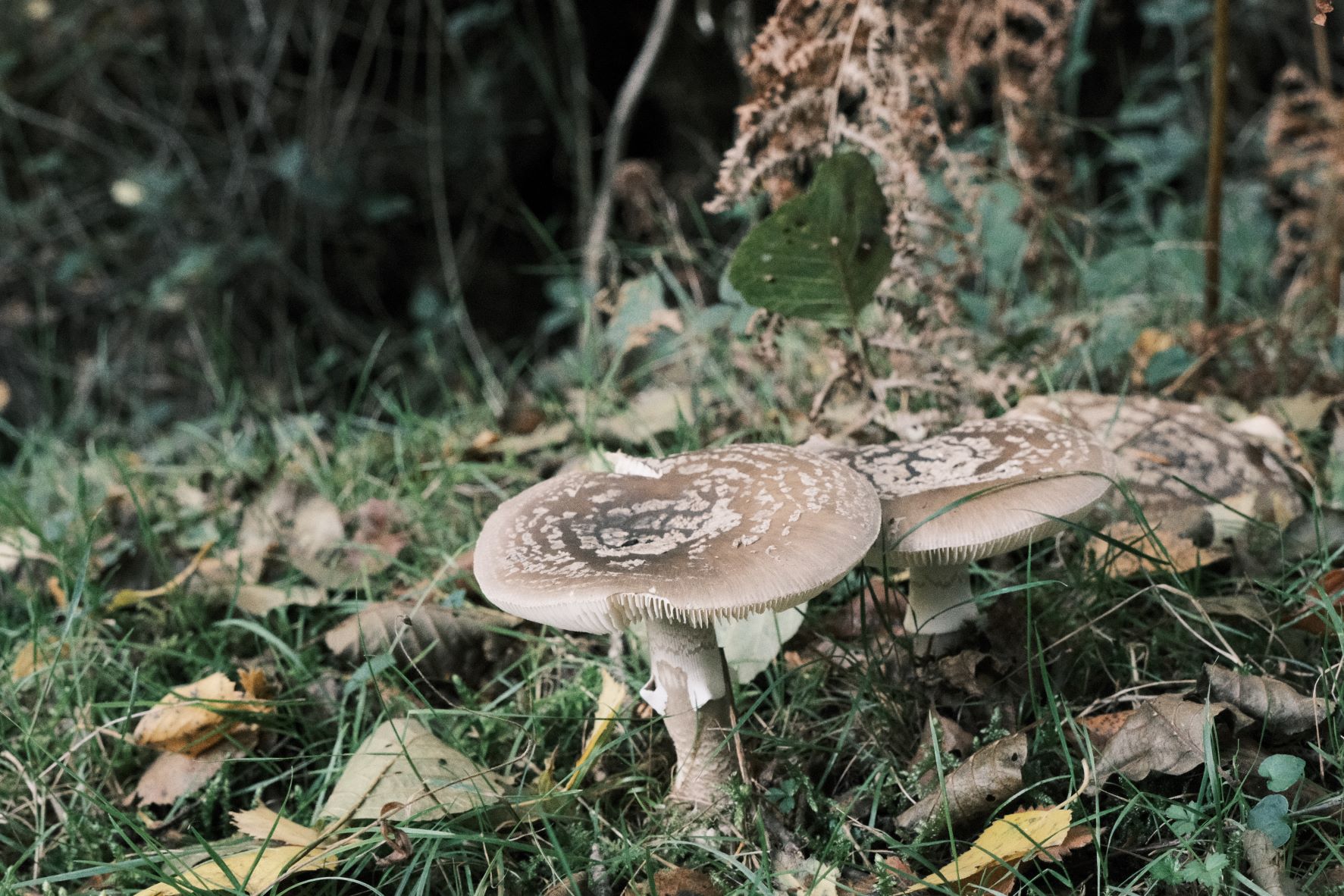
Community Photos
Photos taken with the Nostalgic Fujicolor film recipe by members of the Film Recipes community.
Photos by Alex Tenhave

Using the Nostalgic Fujicolor Film Recipe
Each film simulation recipe has its own character and style. These features mean recipes are more suited to certain situations, or when seeking a particular look. Here are the categories that Nostalgic Fujicolor has been tagged with.


Leave a Reply