Inspired by old magazine photos, capture an aged look with the Nostalgic Negative film simulation

Nostalgic Print
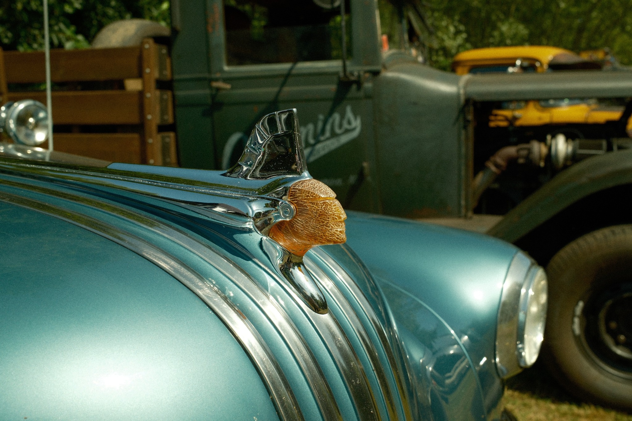
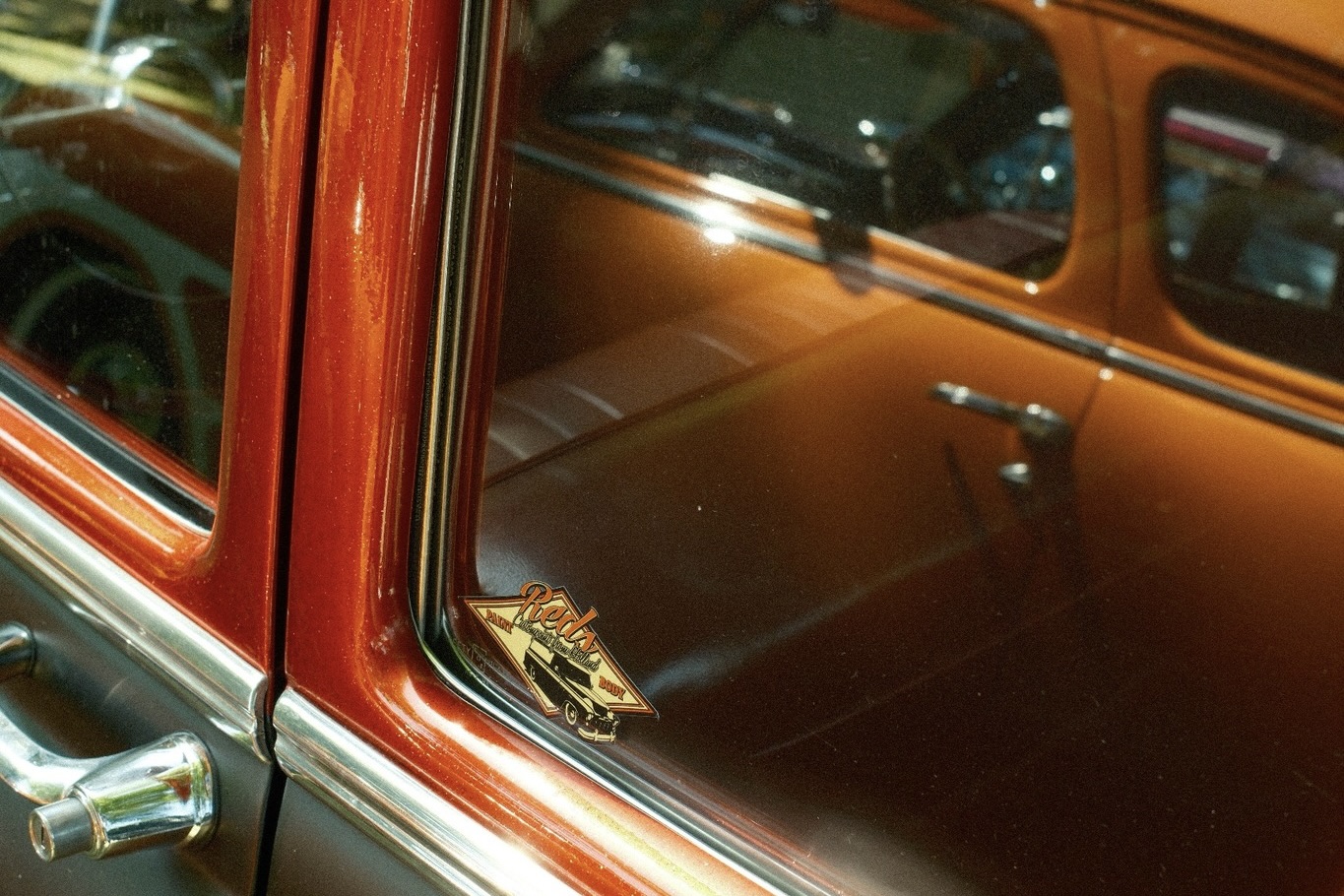
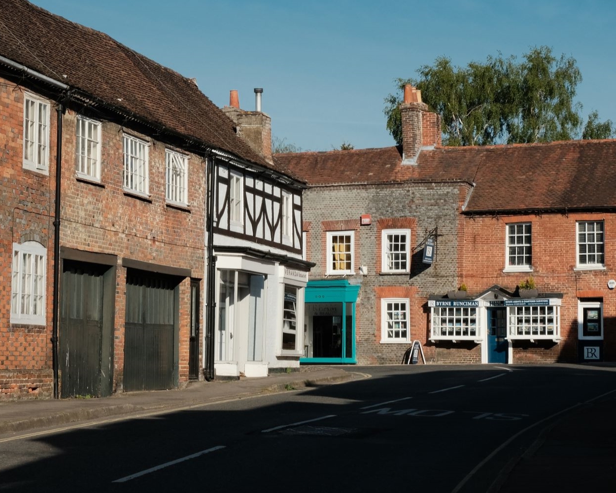
The Nostalgic Negative film simulation offers a wonderfully warm and mellow tone on standard settings, and brings a feel of an older printed image. For this film recipe using Nostalgic Negative, I wanted to lean into these characteristics to explore the nostalgic aesthetic.
For me, the result reminds me of old magazine prints, perhaps like those forgotten periodicals that end up in waiting rooms or and the back of bookshelves.
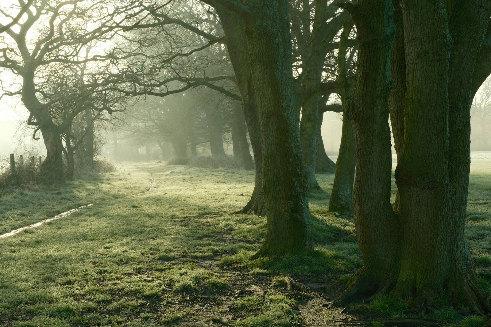
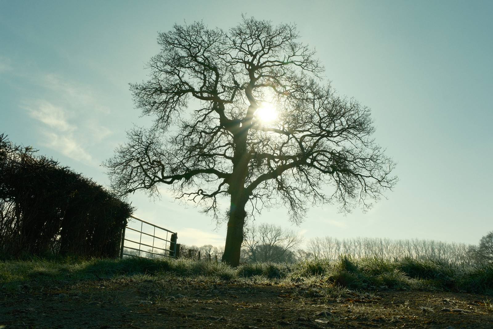
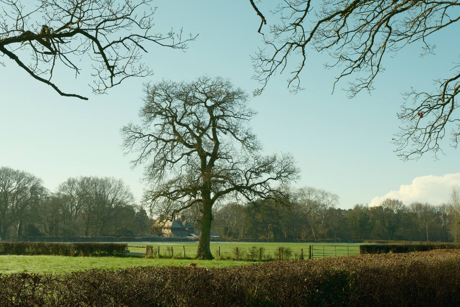
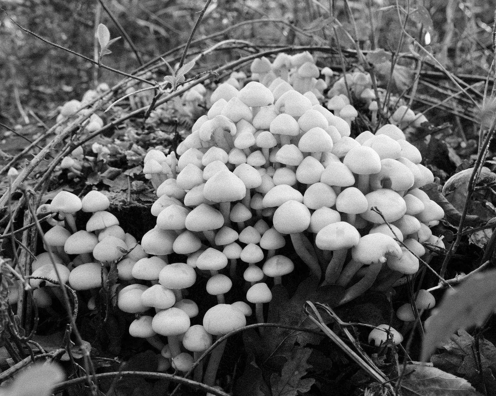
This recipe has a dominant warm tone and a nostaltic aged feel to the images. It’s cosy without being sickly, and as a result, is well suited to outdoor photography on sunny days and in the golden hour. I also tested it on a drizzly grey walk in the woods, and found that the mellow warm tones worked well in these conditions. The Nostalgic Negative simulation is actually quite contrasty and saturated by default, so there’s a small counter adjustment too, which rebalances this.
The mood is similar to my Aged Kodak Portra recipe and Nostalgic Standard film recipes, which are both also compatible with X-Trans IV. This one however, needs Nostalgic Negative for the base look, so it’s a choice only for newer cameras, like X-H2S, X-T5, X100VI or X-S20.
Nostalgic Print Film Recipe Settings
| Film Simulation | Nostalgic Negative |
| Grain Effect | Weak, Small |
| Col. Chr. Effect | Weak |
| Col. Chr. Blue | Off |
| White Balance | Auto, ‑2 Red, ‑7 Blue |
| Dynamic Range | DR200 |
| Highlights | ‑1 |
| Shadows | ‑1 |
| Colour | ‑2 |
| Sharpness | ‑2 |
| ISO N.R. | ‑4 |
| Clarity | 0 |
| EV Comp. | +1/3 |
Similar Recipes


More similar recipes, and hundreds more exclusive looks, are available in the Film Recipes App.
Get the Film Recipes App
Browse, filter and search the full recipe library in seconds


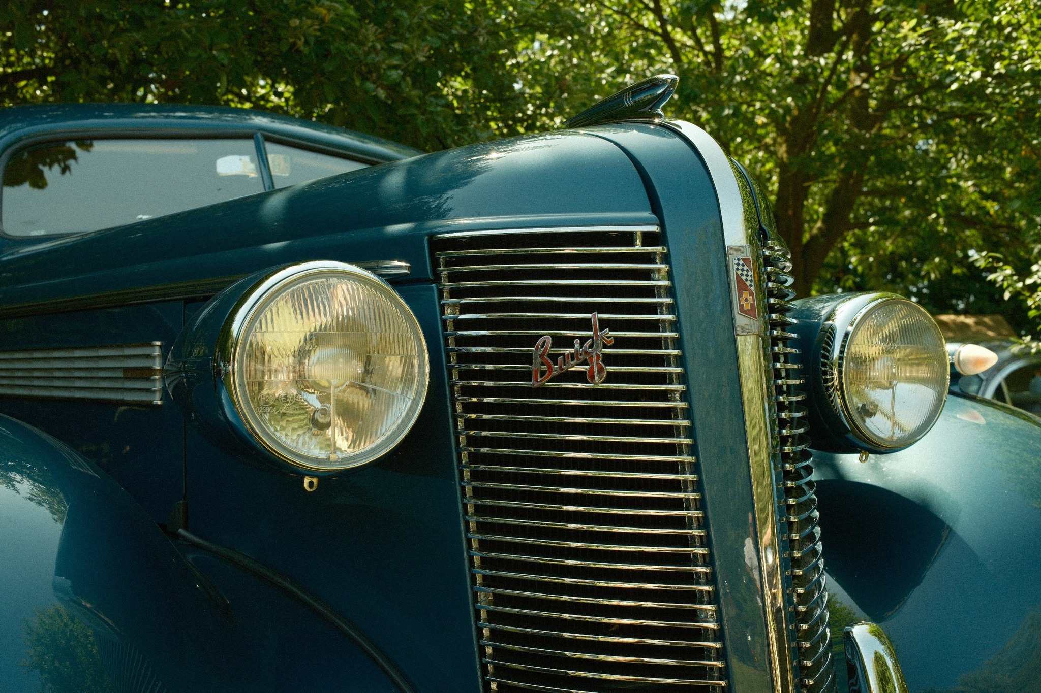
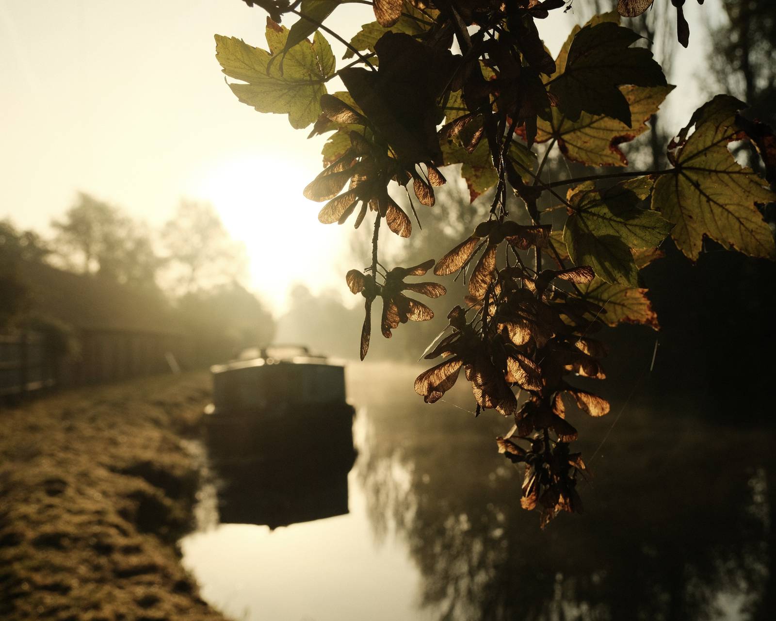
Nostalgic Print Film Recipe: Sample Photos
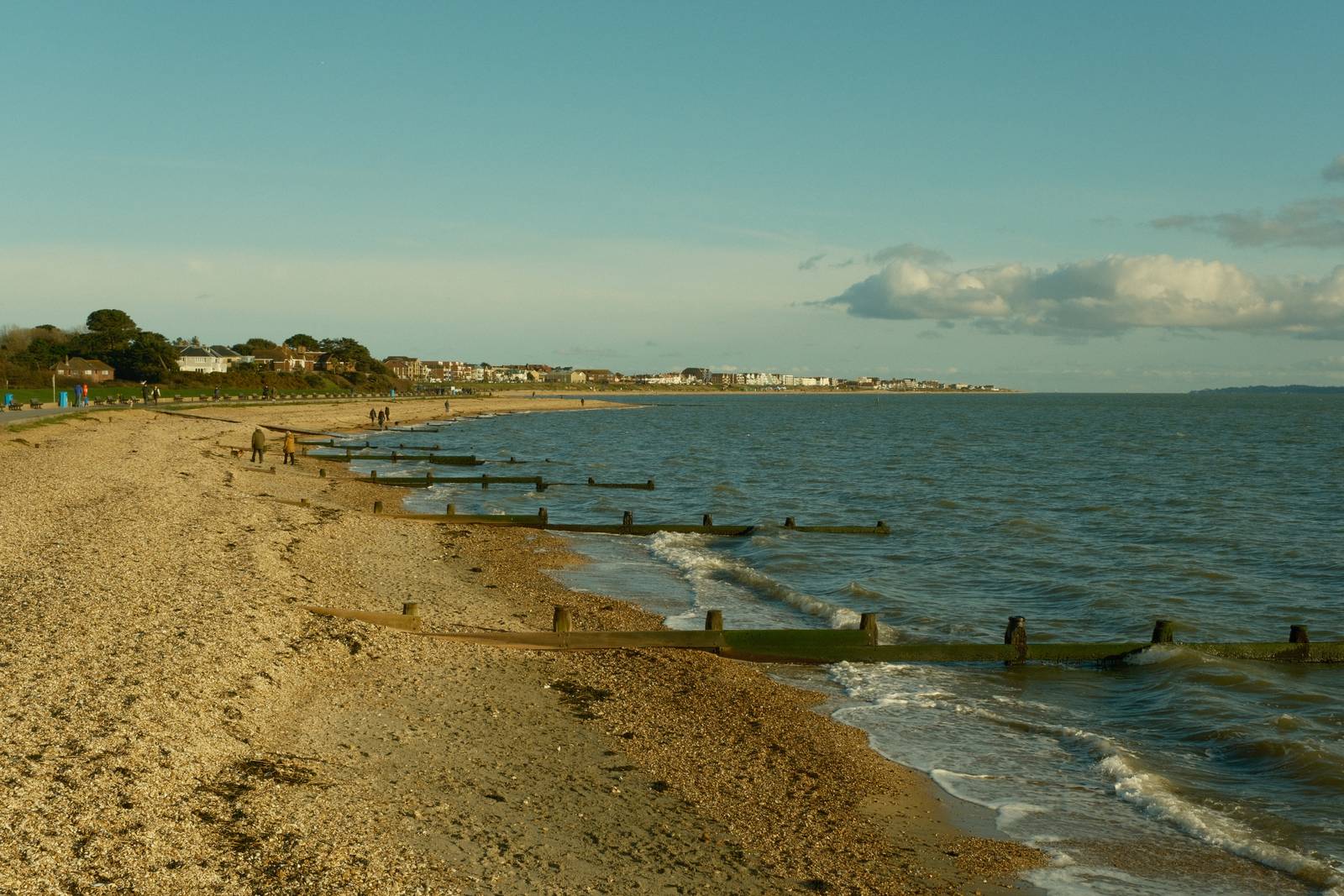


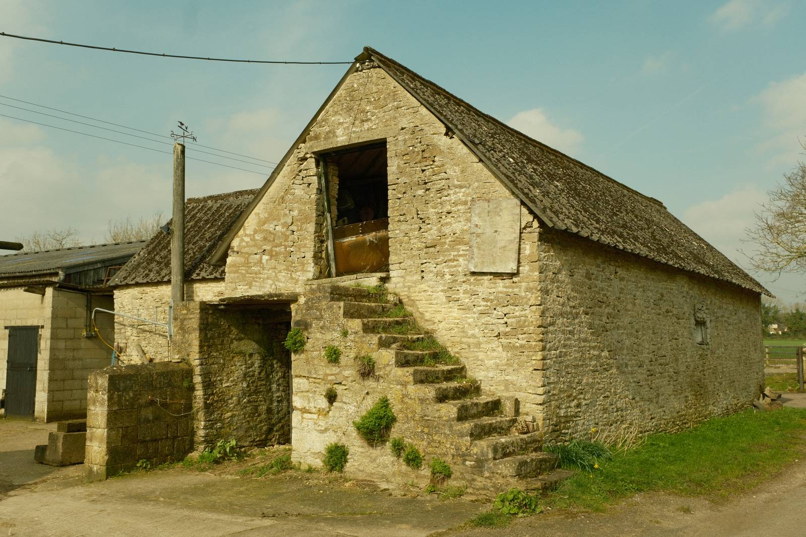

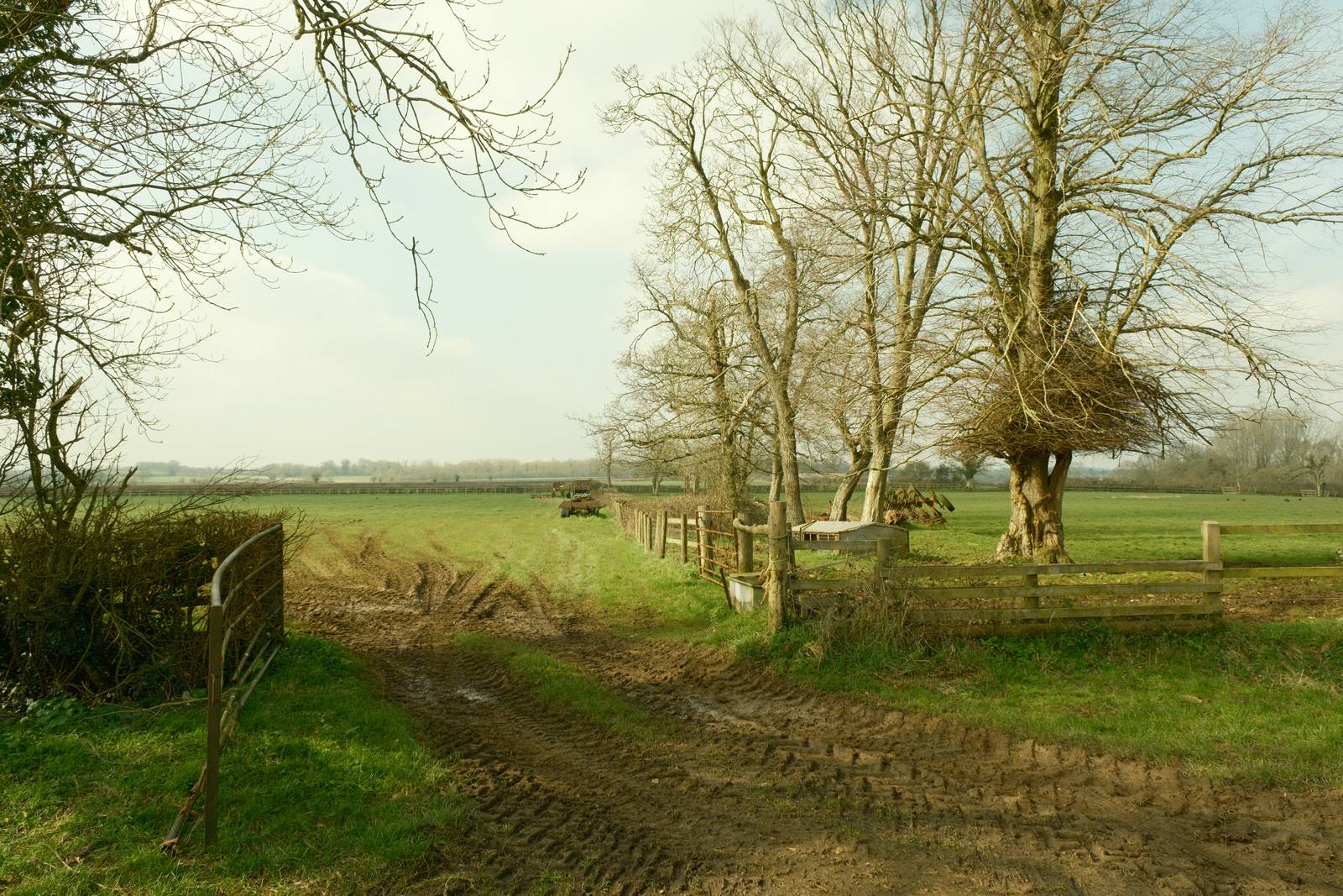
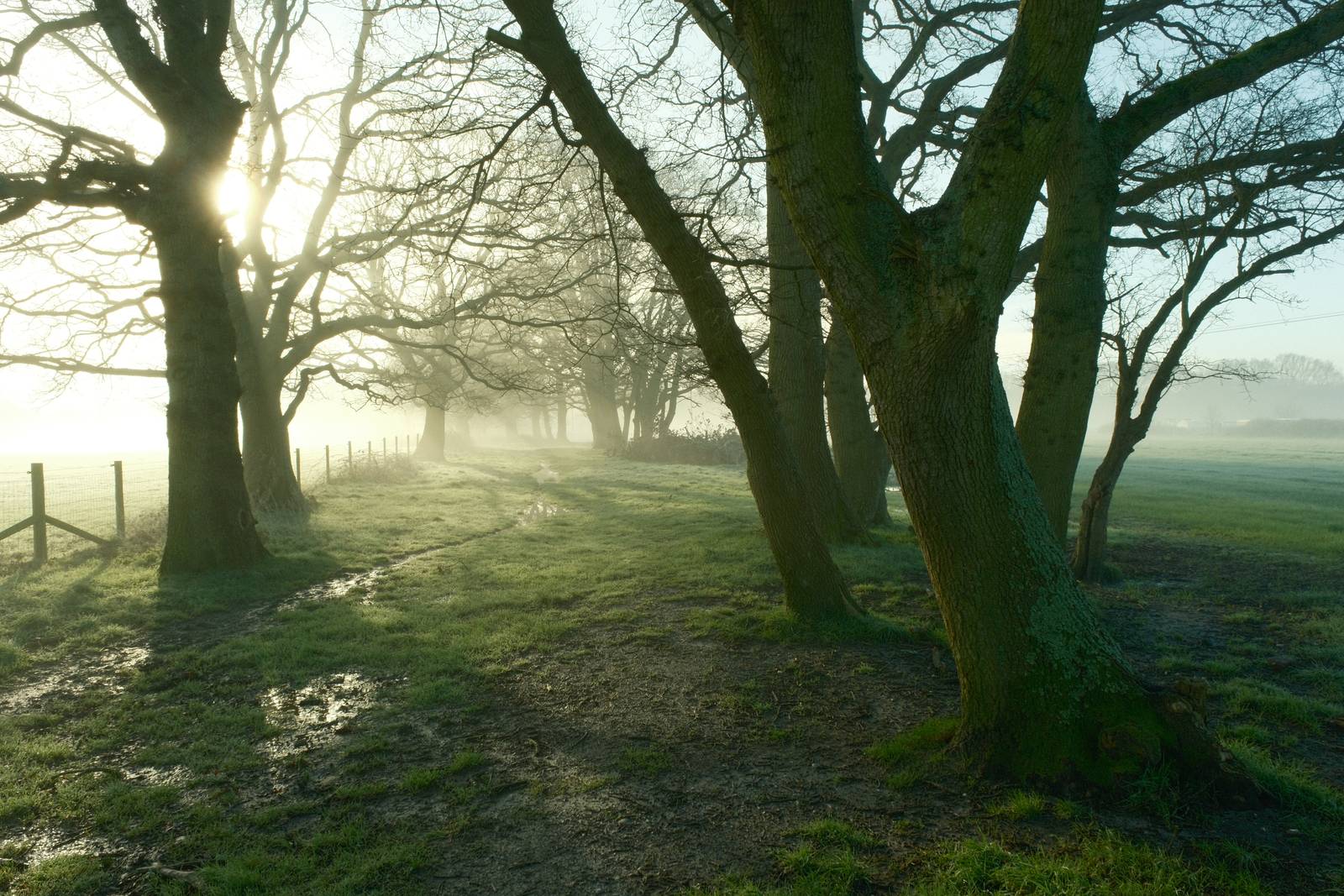


Community Photos
Photos taken with the Nostalgic Print film recipe by members of the Film Recipes community.
Photos by Bert Broekhuis


Using the Nostalgic Print Film Recipe
Each film simulation recipe has its own character and style. These features mean recipes are more suited to certain situations, or when seeking a particular look. Here are the categories that Nostalgic Print has been tagged with.


Leave a Reply