X100v Classic Negative film recipe for beautiful blues and whites

Pastel Vibes
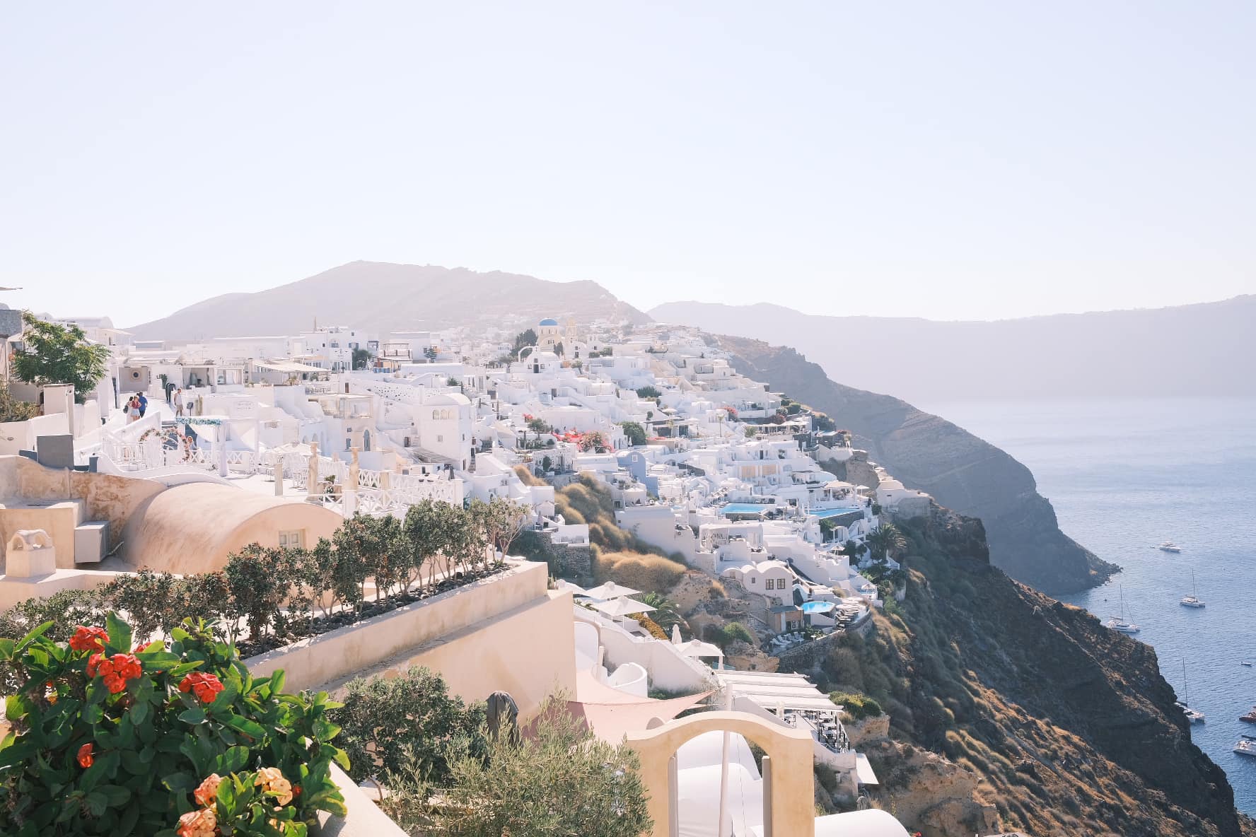
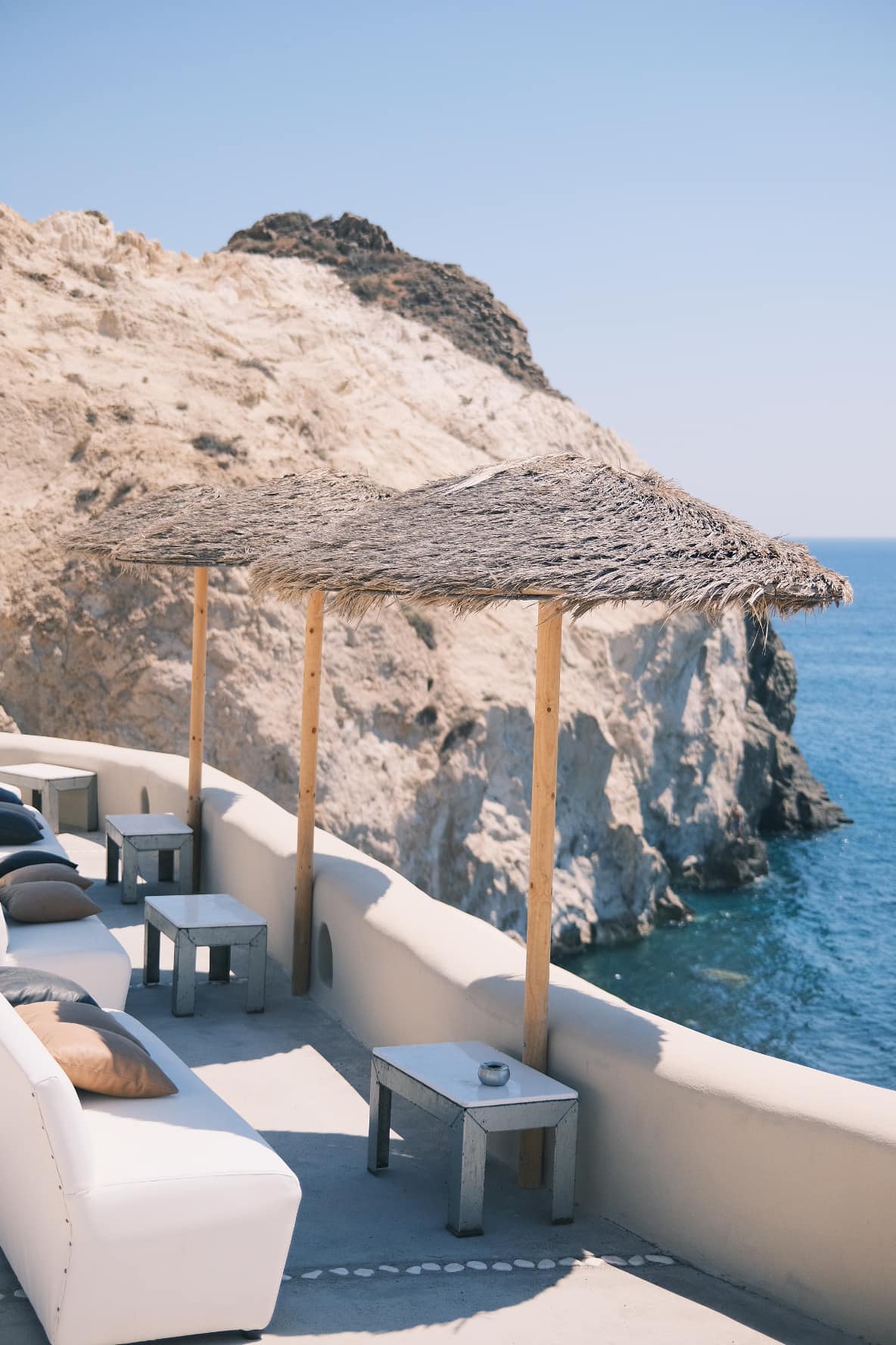
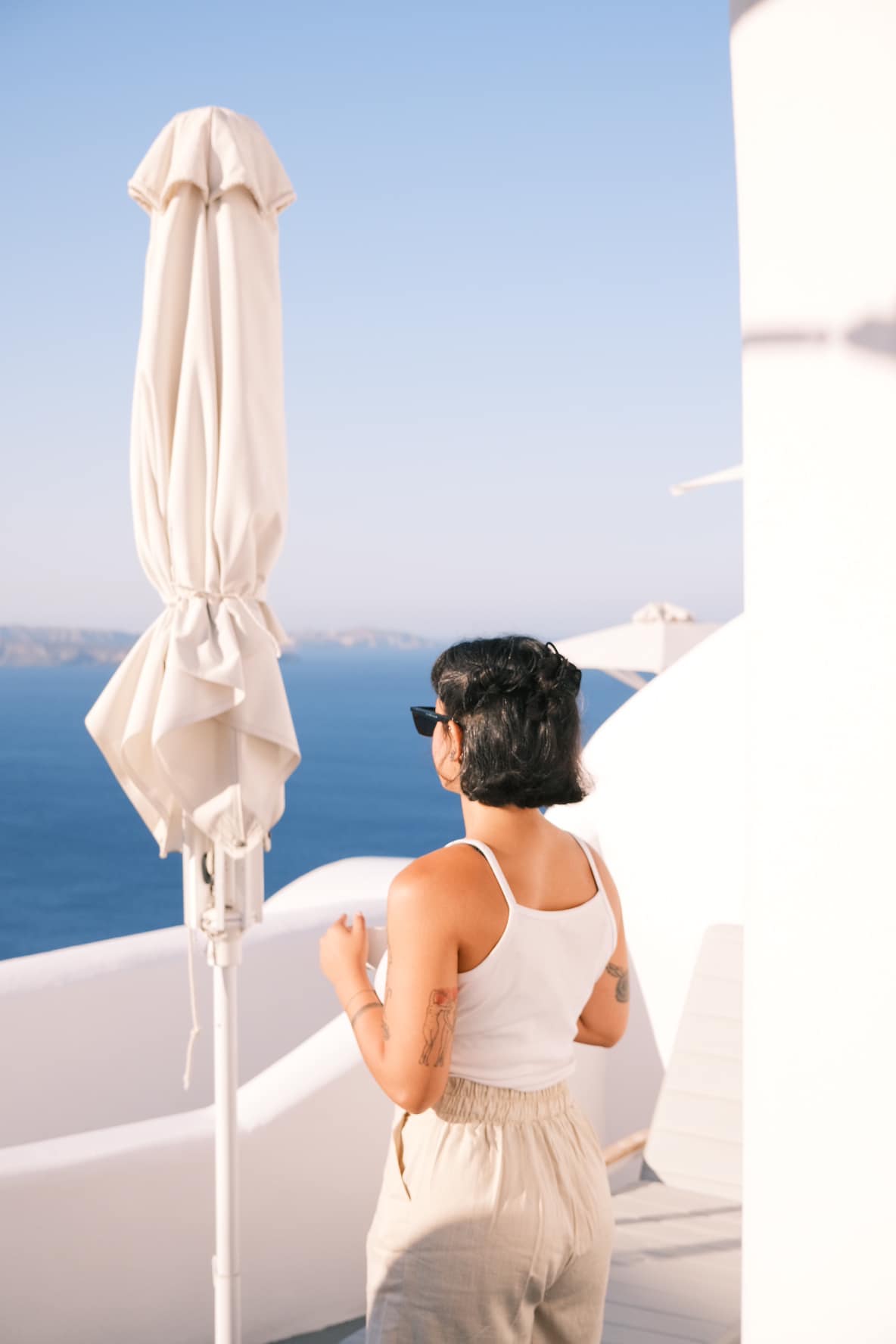
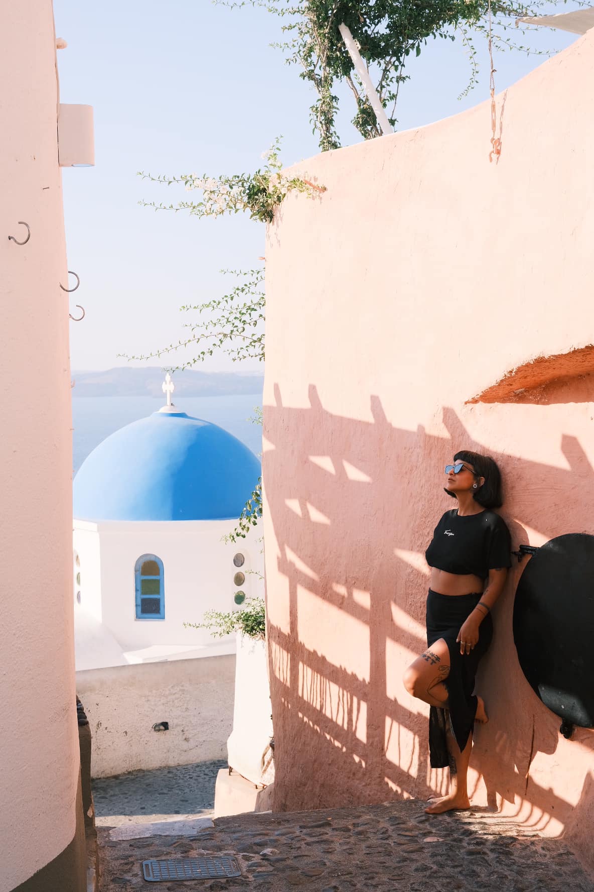
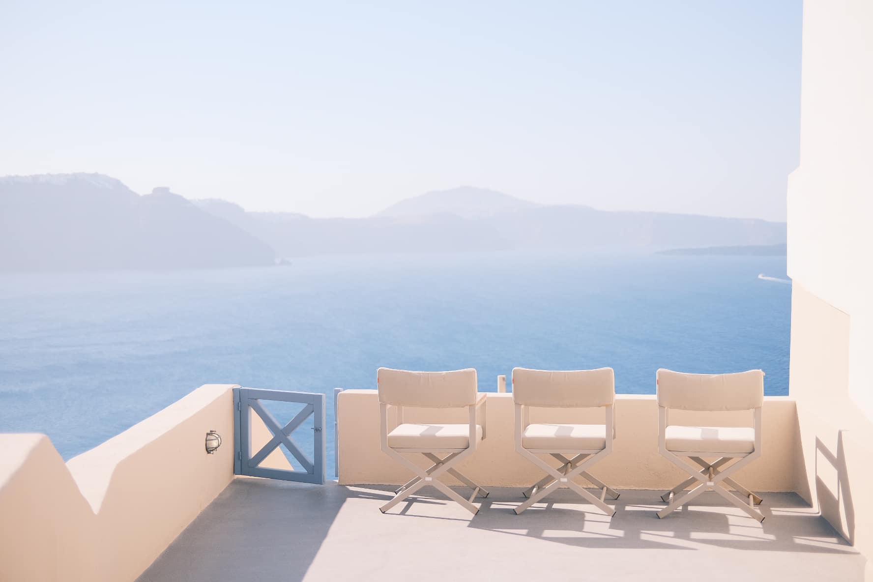
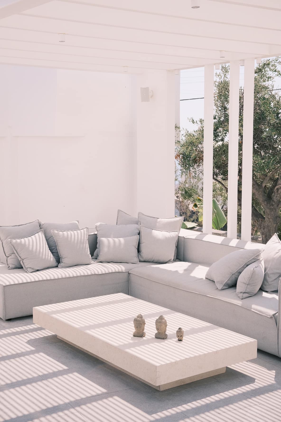
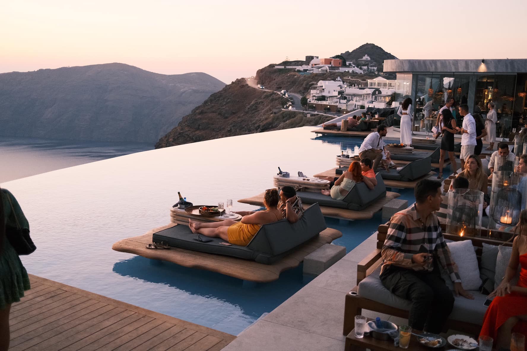
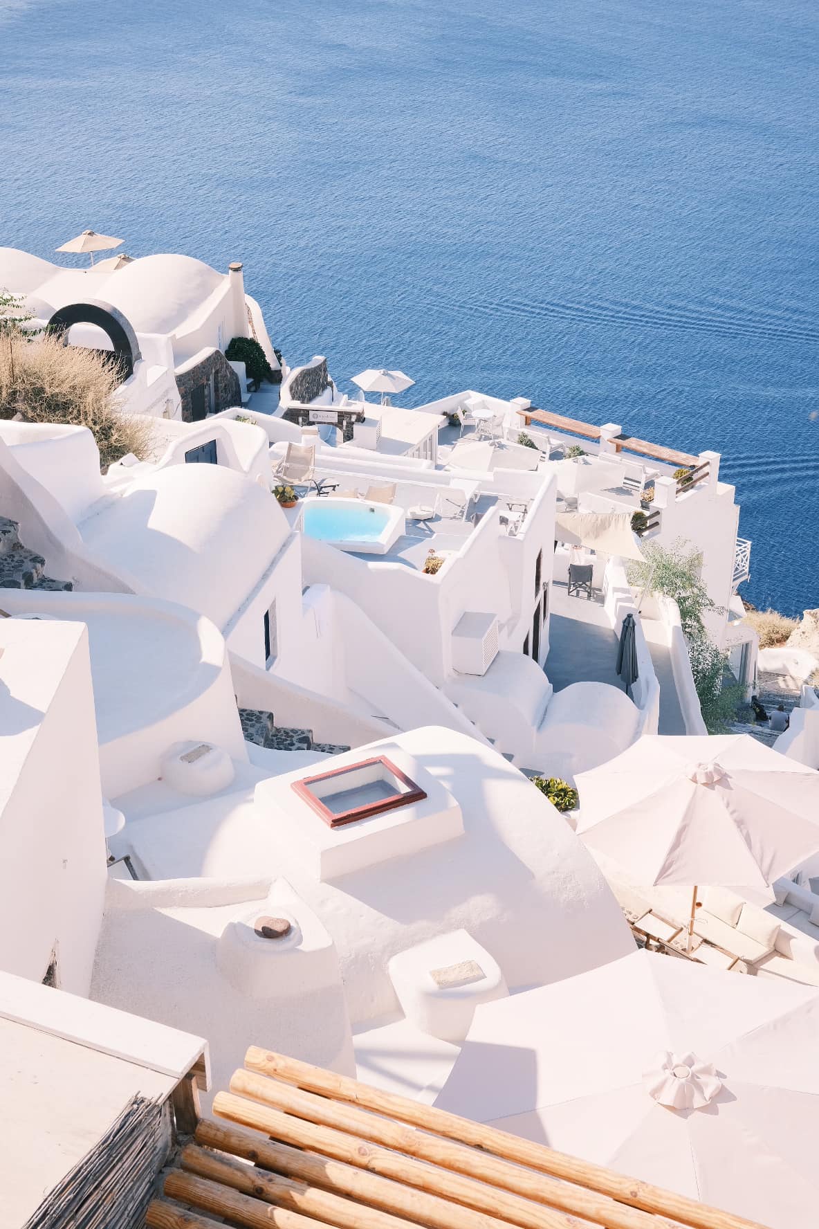
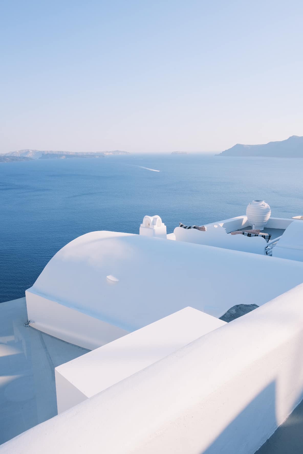
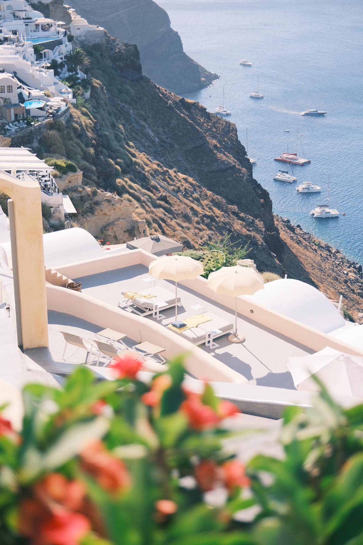
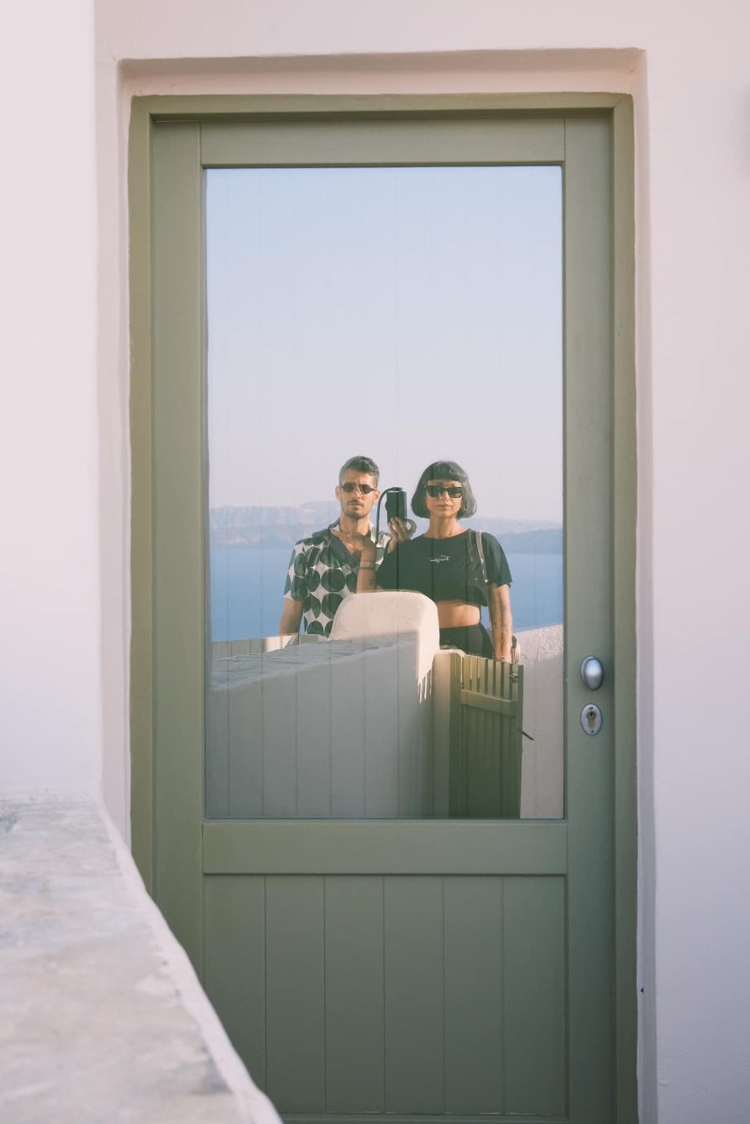
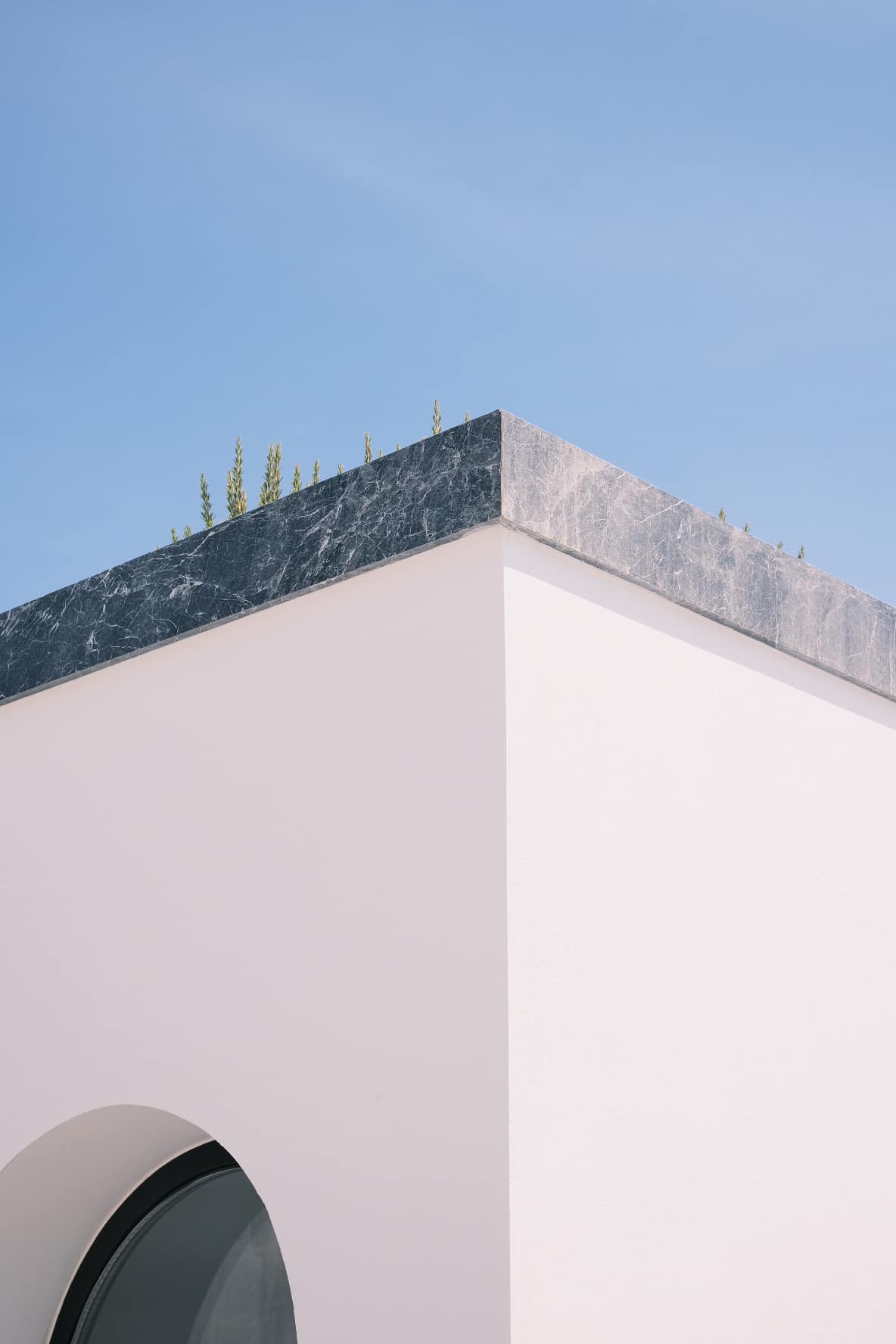
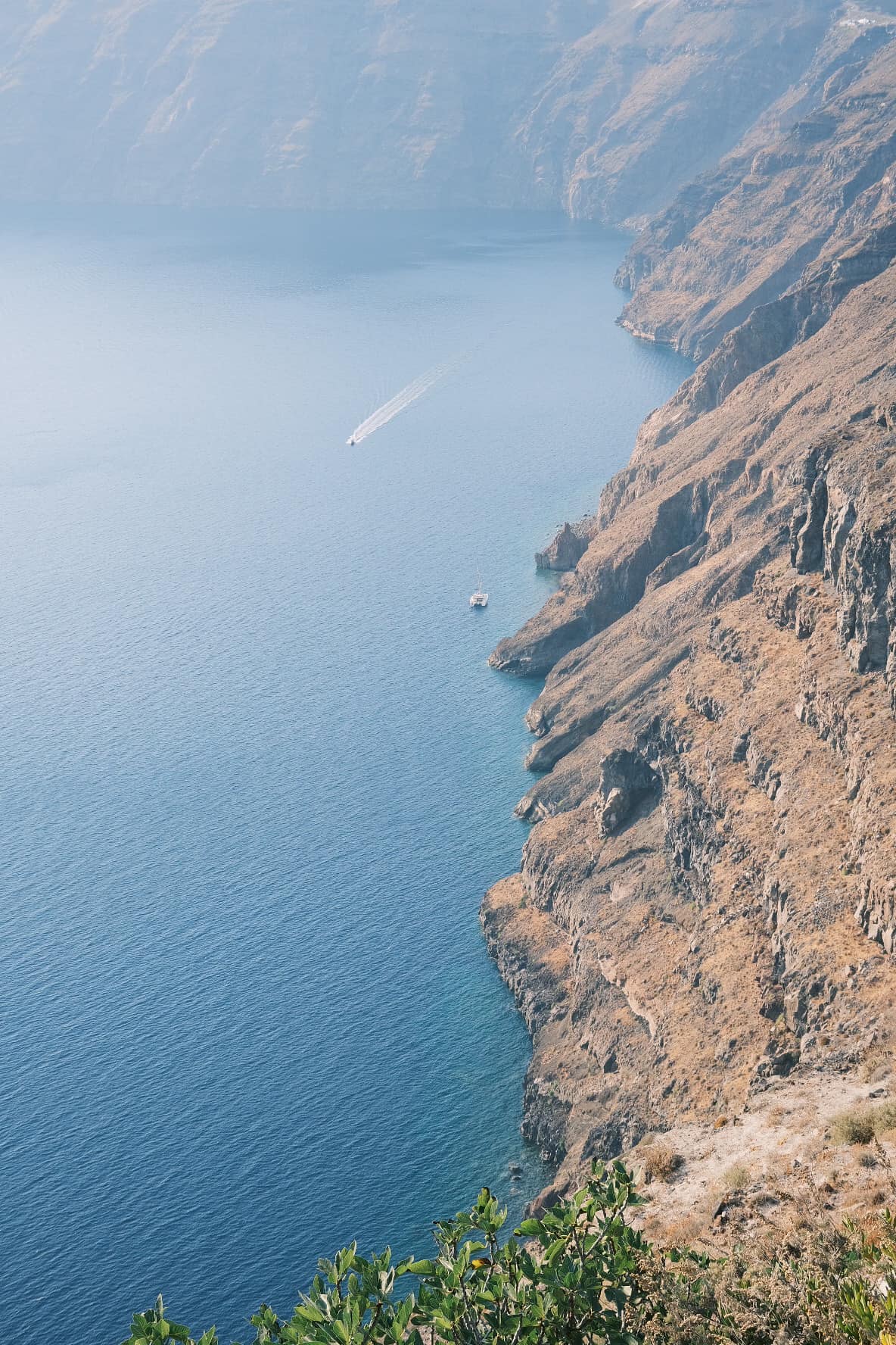
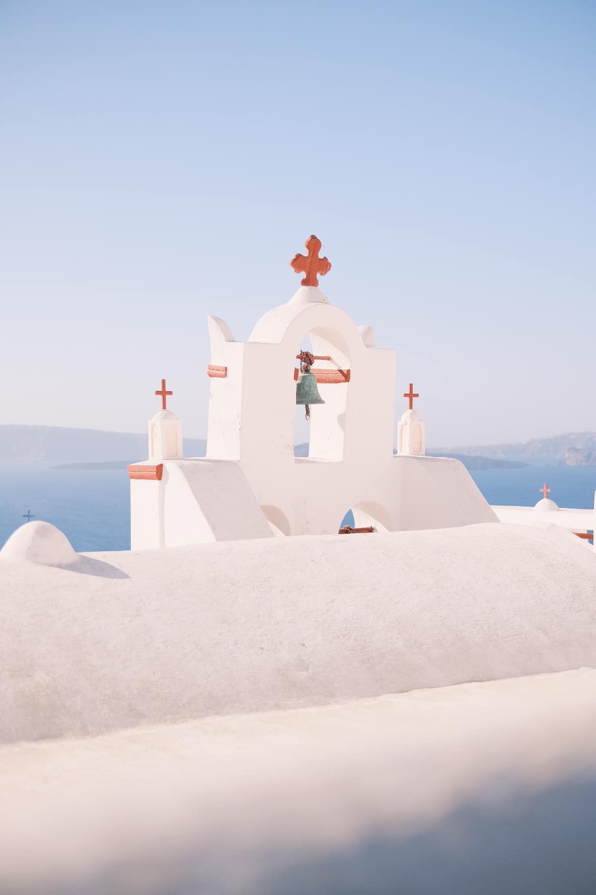
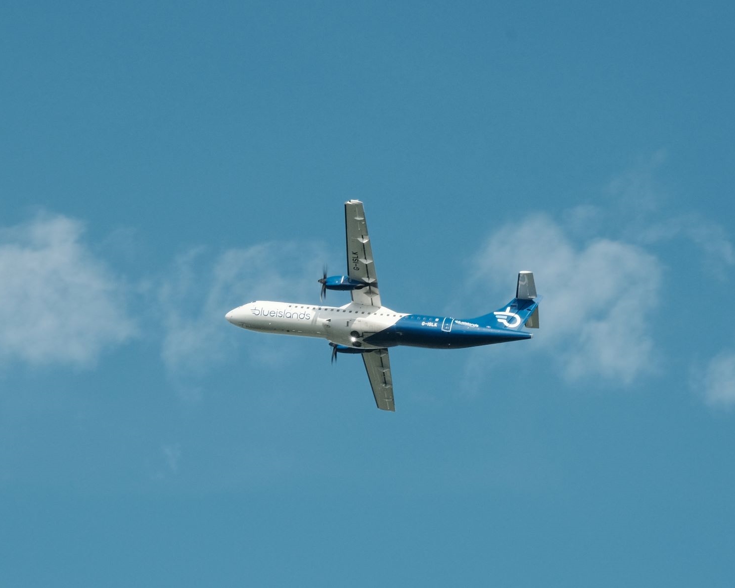
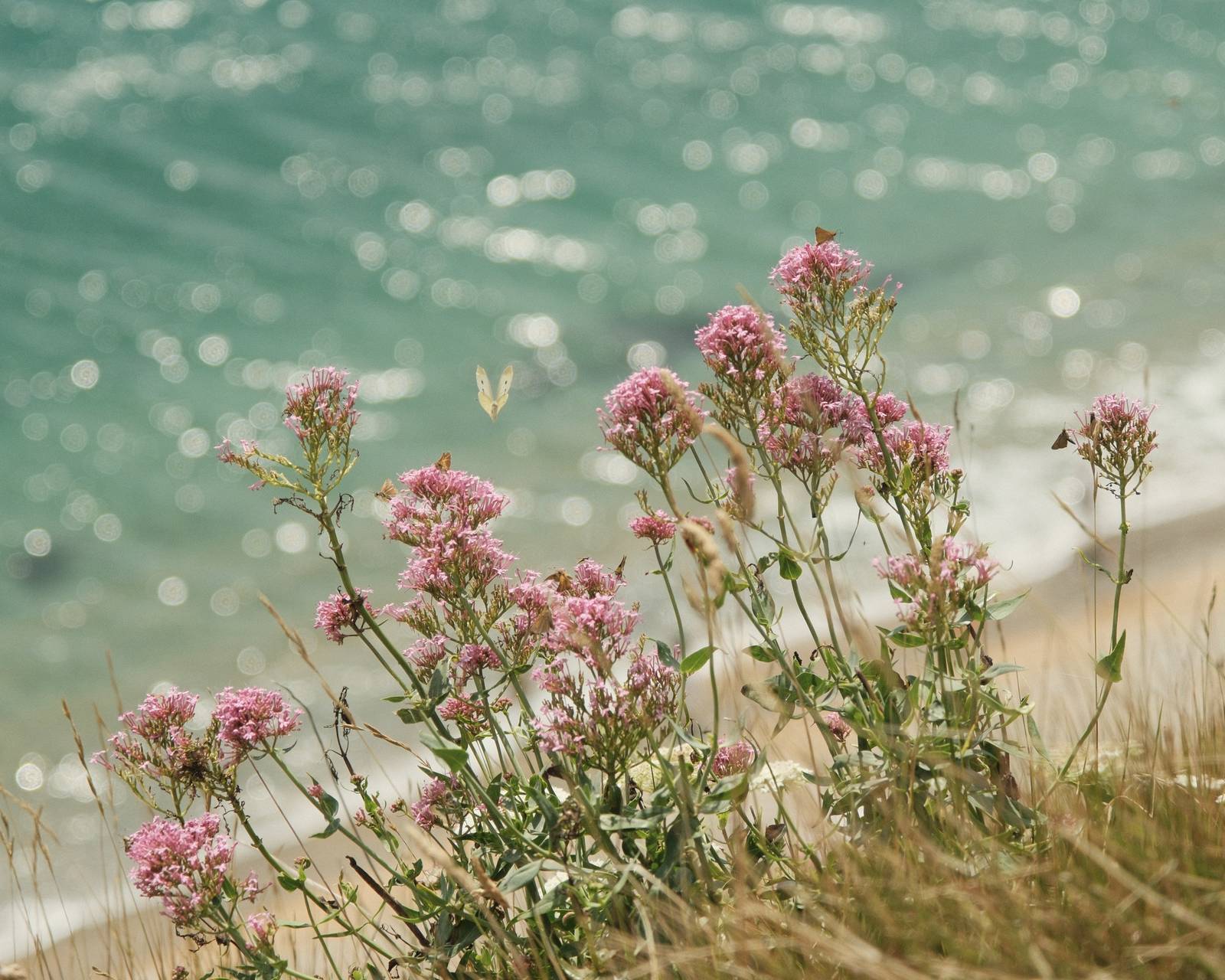
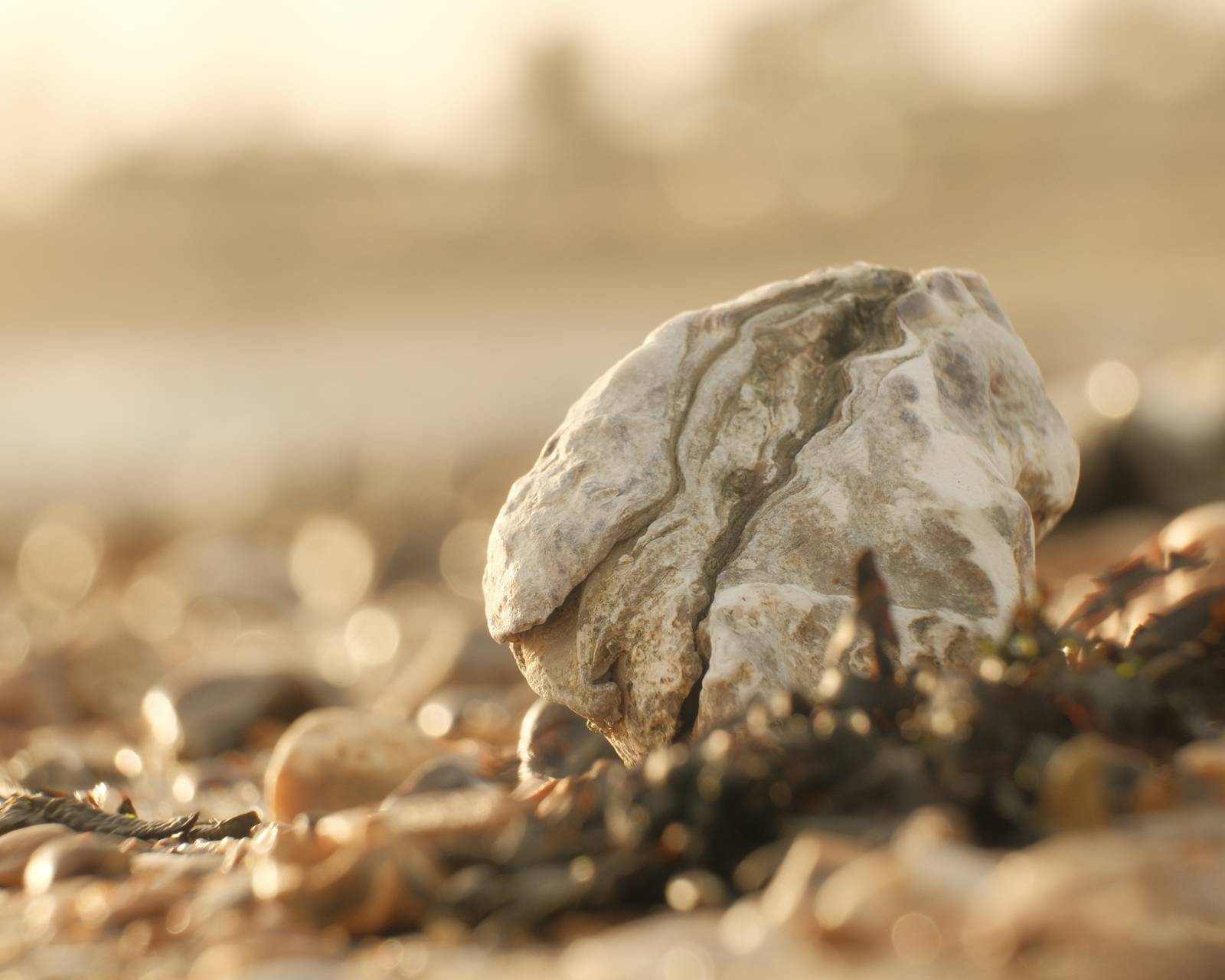
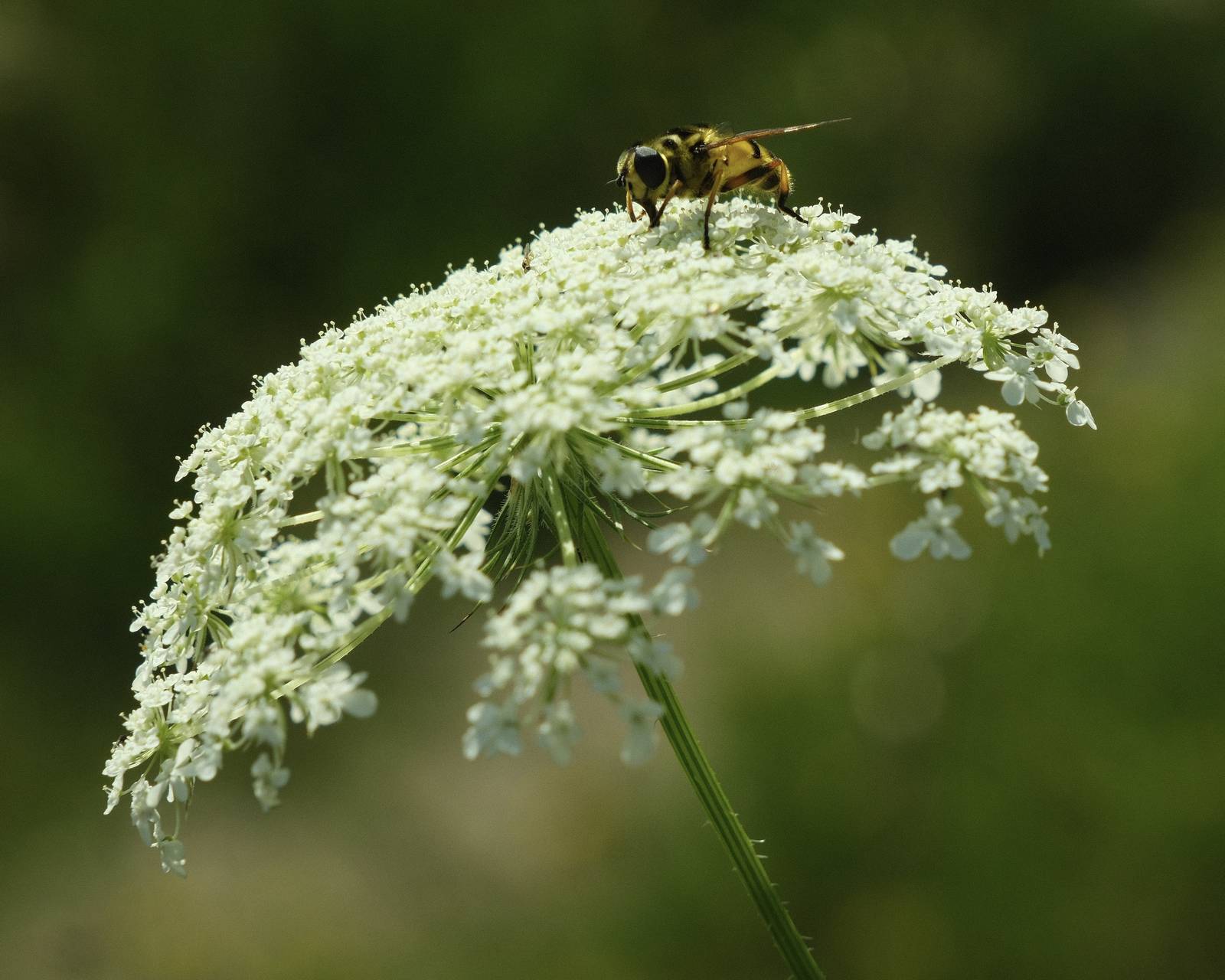
The beautiful Greek island of Santorini is a photography paradise, with its characteristic white and blue buildings and far reaching ocean views. This colour palette has been masterfully captured by Willow Rotter on his X100V using his film recipe, Pastel Vibes.
Willow’s photographic style is towards ‘high key’ with images typically over exposed by +1. In this recipe, a -2 setting for highlights helps to preserve detail and give a wonderfully bright and airy image. He also says, that if you want the highlights to be a little red use R: 0, rather than R: -1. Some of the photos was R: 0 & some are R: -1.
Photo credits: Willow Rotter
Pastel Vibes Film Recipe Settings
| Film Simulation | Classic Negative |
| Grain Effect | Off |
| Col. Chr. Effect | Weak |
| Col. Chr. Blue | Off |
| White Balance | Auto, ‑1 Red, 0 Blue |
| Dynamic Range | DR400 |
| Highlights | ‑2 |
| Shadows | ‑1 |
| Colour | 3 |
| Sharpness | 1 |
| ISO N.R. | ‑4 |
| Clarity | 2 |
| EV Comp. | +1 |
Get the Film Recipes App
App-exclusive recipes you won’t find anywhere else


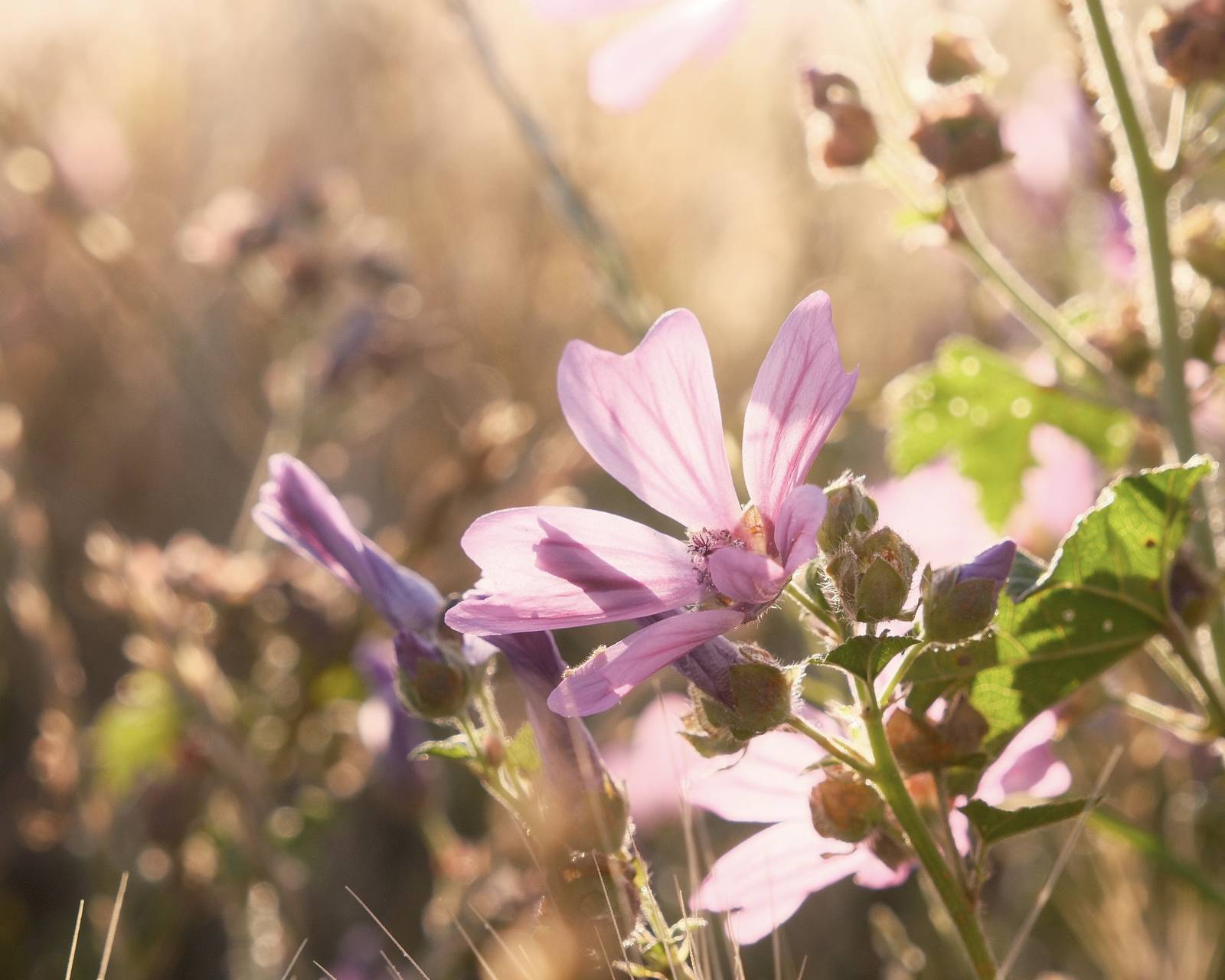
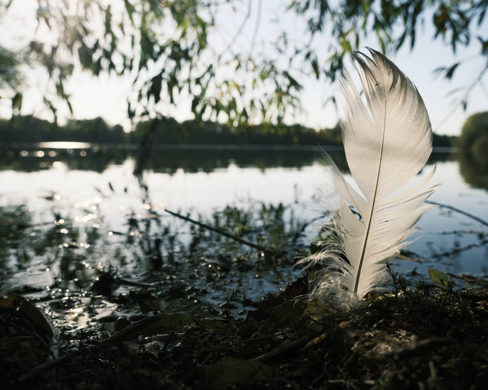
Pastel Vibes Film Recipe: Sample Photos


Using the Pastel Vibes Film Recipe
Each film simulation recipe has its own character and style. These features mean recipes are more suited to certain situations, or when seeking a particular look. Here are the categories that Pastel Vibes has been tagged with.


Leave a Reply