Fujifilm simulation recipe for Classic Negative on X-Trans IV cameras
Back in the Day
One of the most interesting film simulations on Fuji X-series cameras is Classic Negative. If you go back and find film photos printed back in the peak days of Fujicolor 35mm films like Reala, Superia, etc., you’ll see a look that has been magically recreated by the Fujifilm engineers.
This leads me to a deeply nostaligic film recipe, based on Classic Negative that celebrates this old film prints style. It’s set to push up the highlights and colour, because these tweaks give a look that I remember from prints in the 90s, and adds a little softness to hide the digital nature of the shots a little.
The recipe is called Back in the Day, and is great for sunny days and all those holidays and days out that you would have captured on your 35mm camera, back in the day.
Back in the Day Film Recipe Settings
| Film Simulation | Classic Negative |
| Grain Effect | Off |
| Col. Chr. Effect | Off |
| Col. Chr. Blue | Off |
| White Balance | 5600K, +4 Red, ‑5 Blue |
| Dynamic Range | DR200 |
| Highlights | 1.5 |
| Shadows | ‑1.5 |
| Colour | 2 |
| Sharpness | ‑2 |
| ISO N.R. | ‑4 |
| Clarity | 0 |
| EV Comp. | 0 |
Similar Recipes

More similar recipes, and hundreds more exclusive looks, are available in the Film Recipes App.
Get the Film Recipes App
Filter by film simulation, mood, shooting condition and more


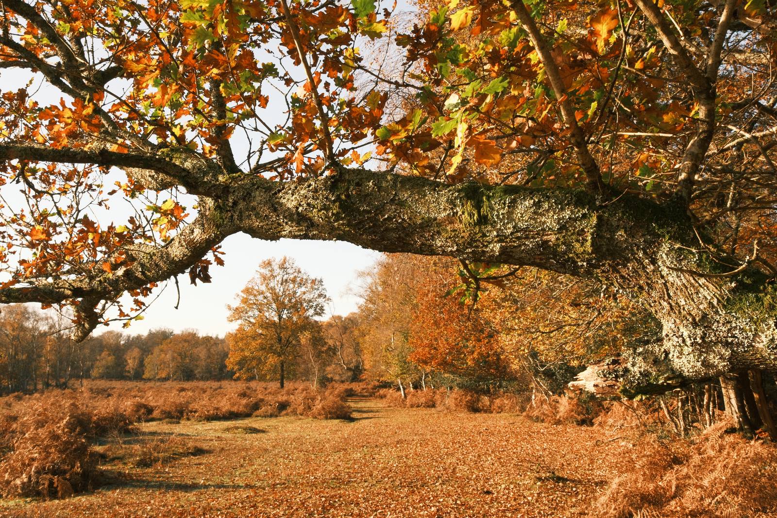
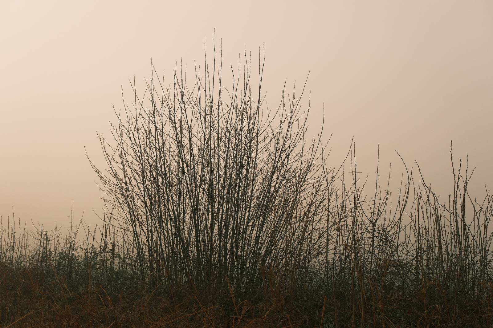
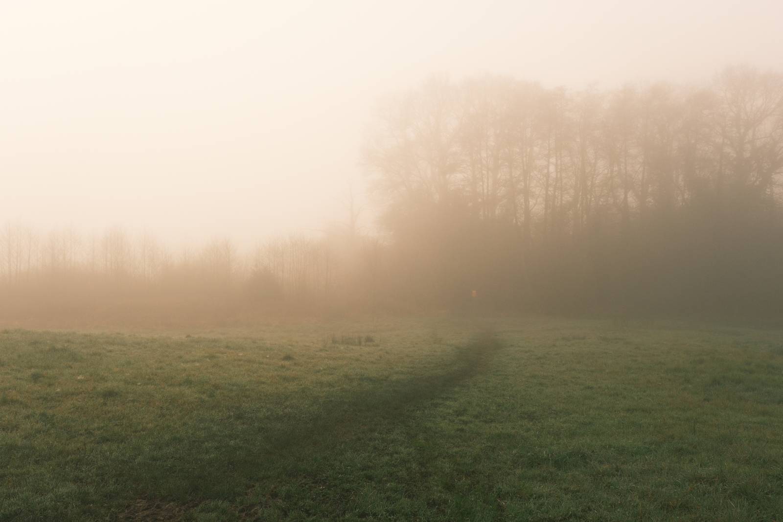
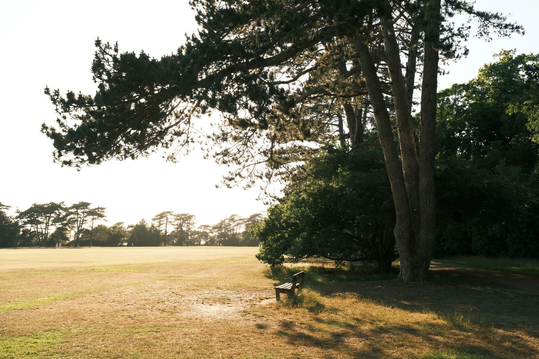
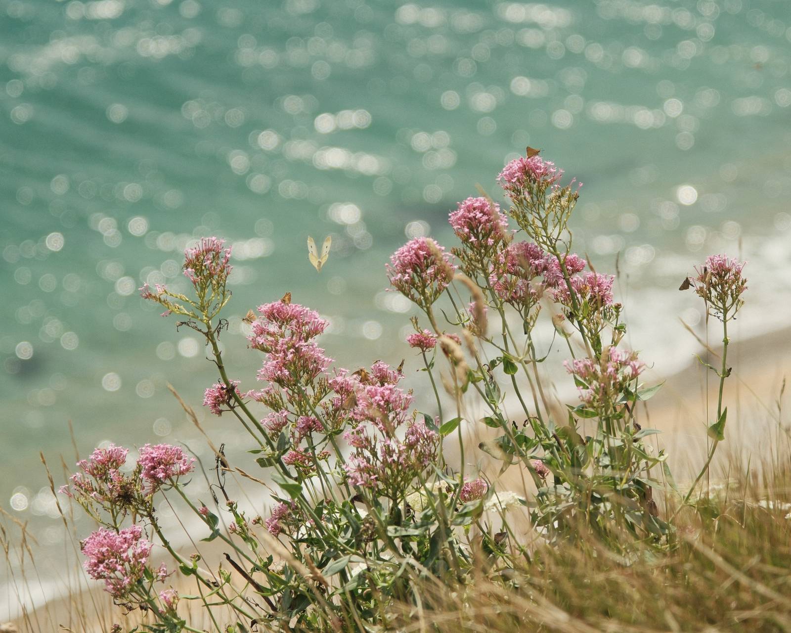
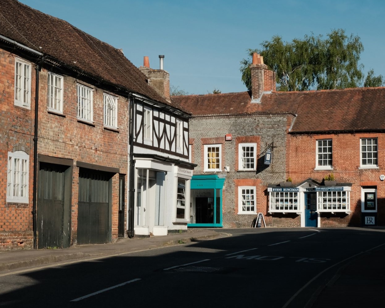
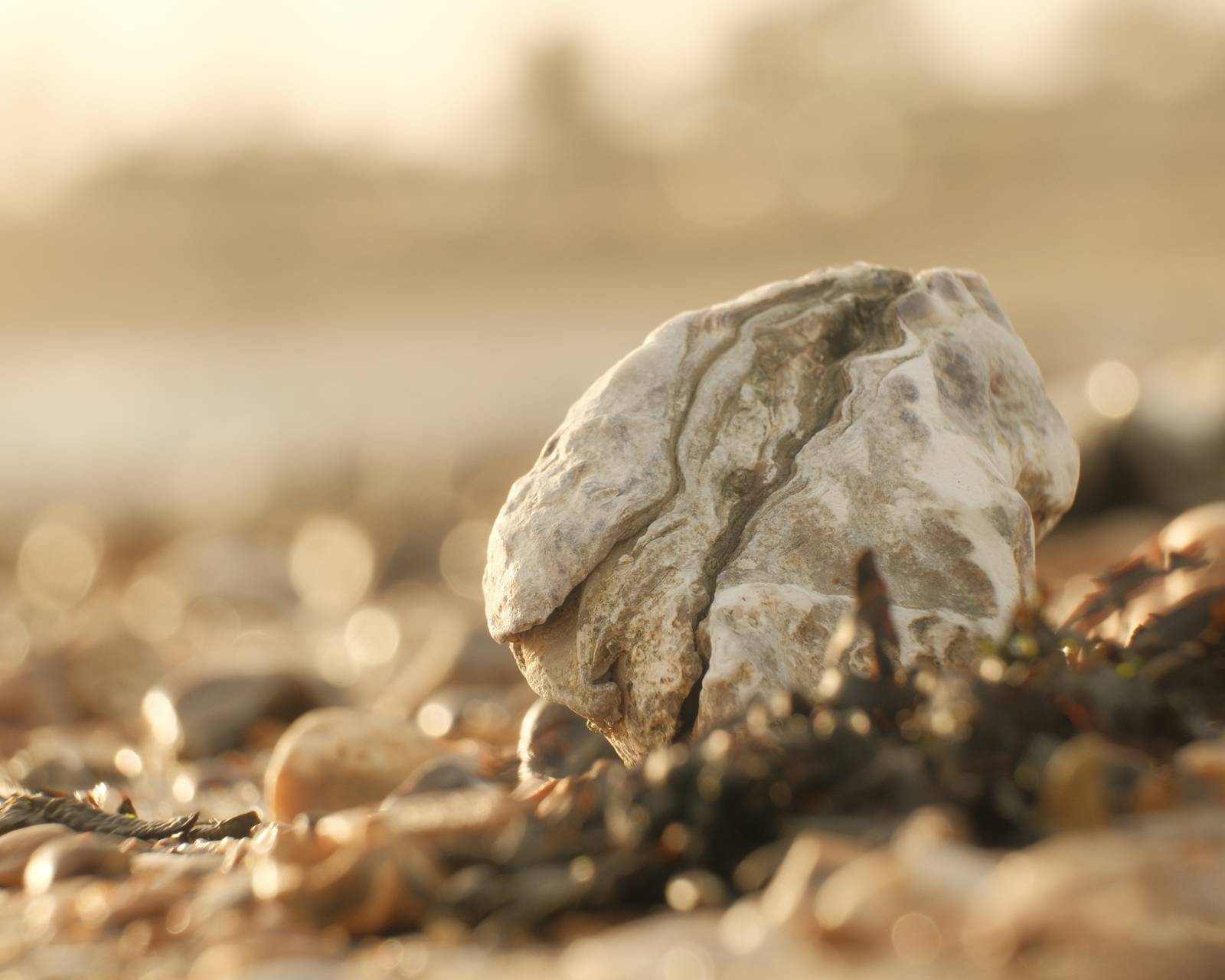
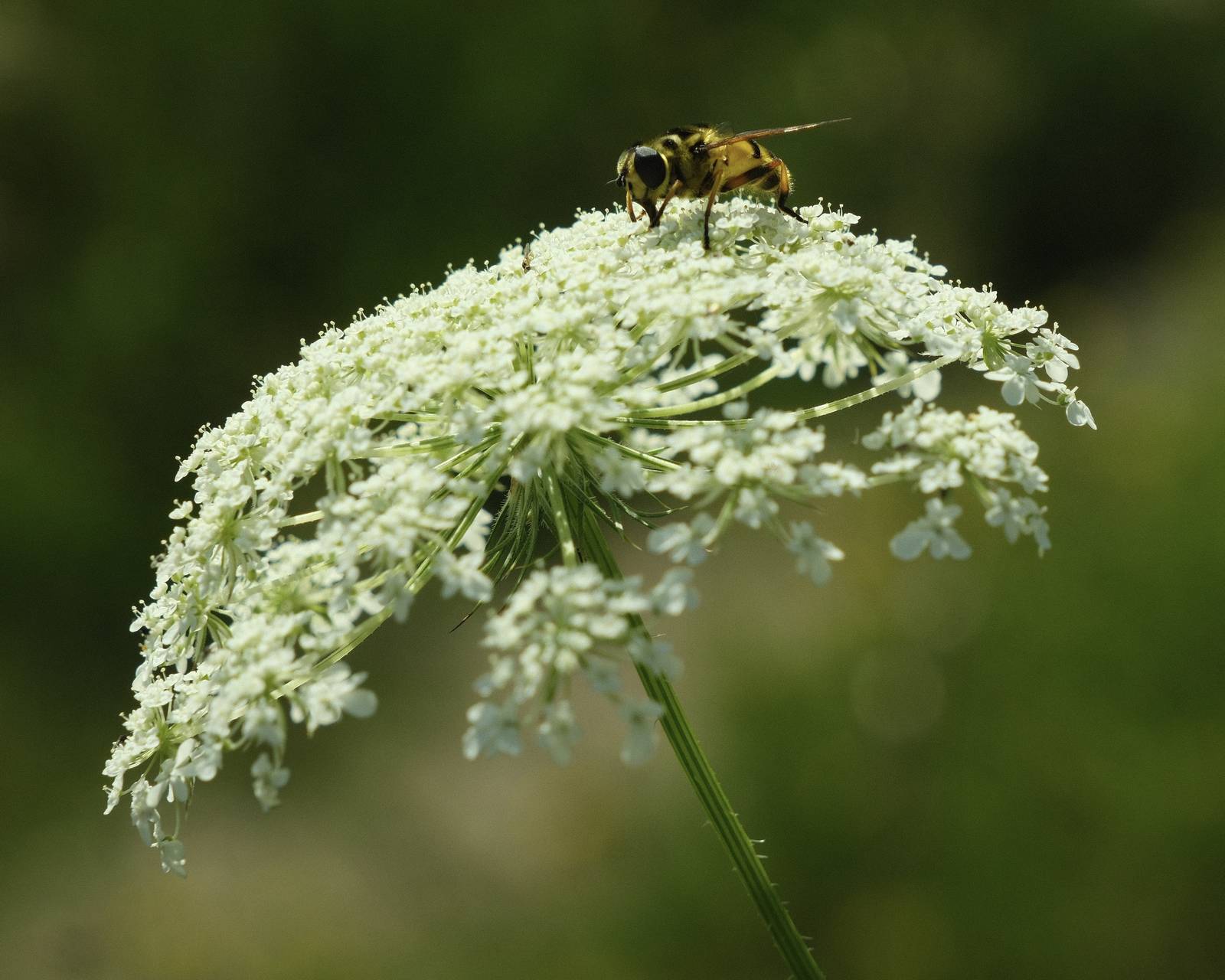
Back in the Day Film Recipe: Sample Photos


Community Photos
Photos taken with the Back in the Day film recipe by members of the Film Recipes community.
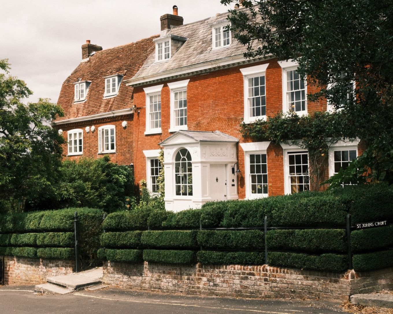
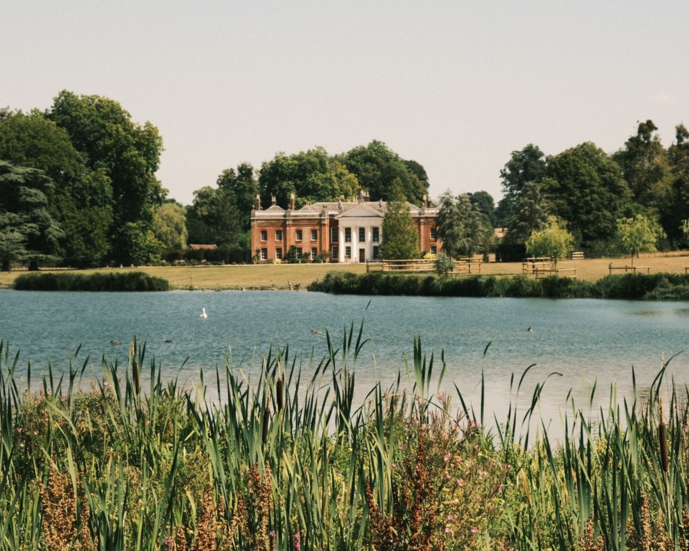
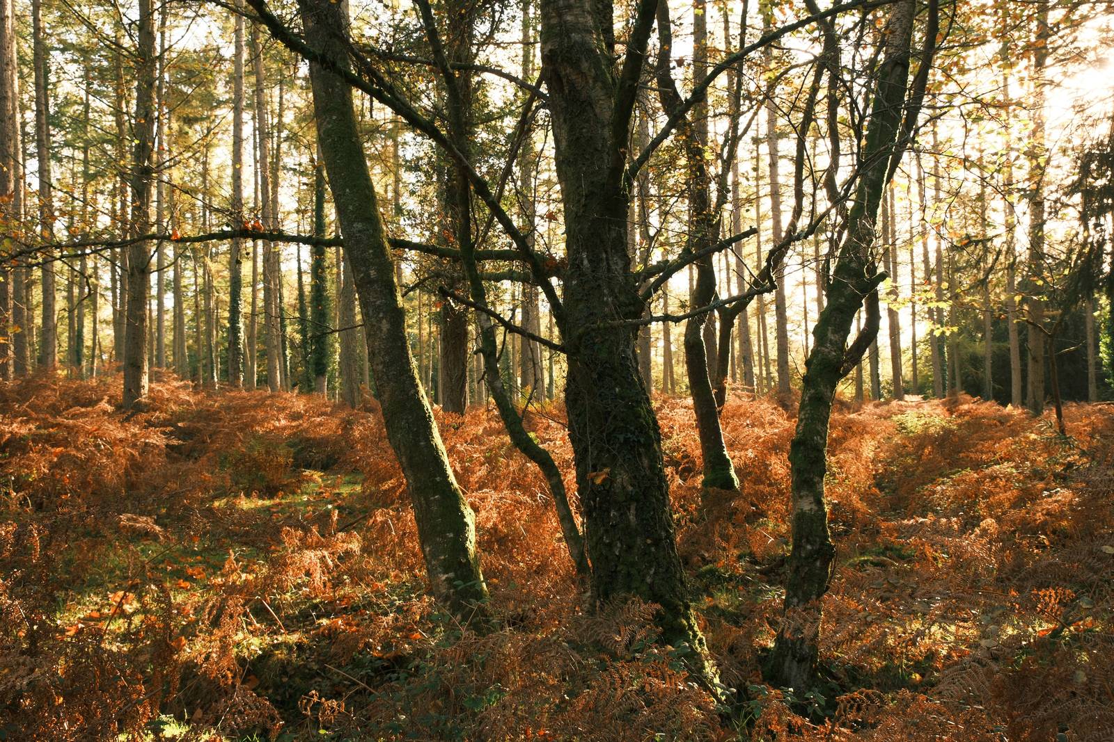
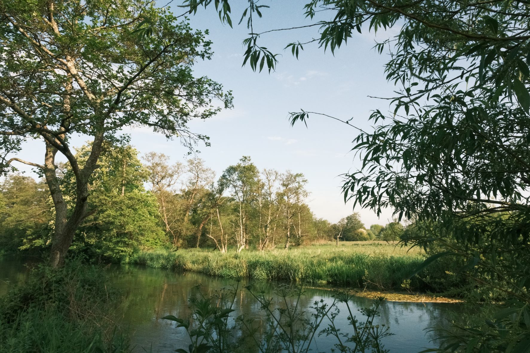
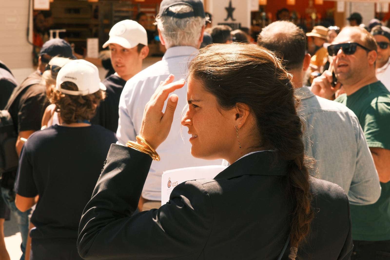
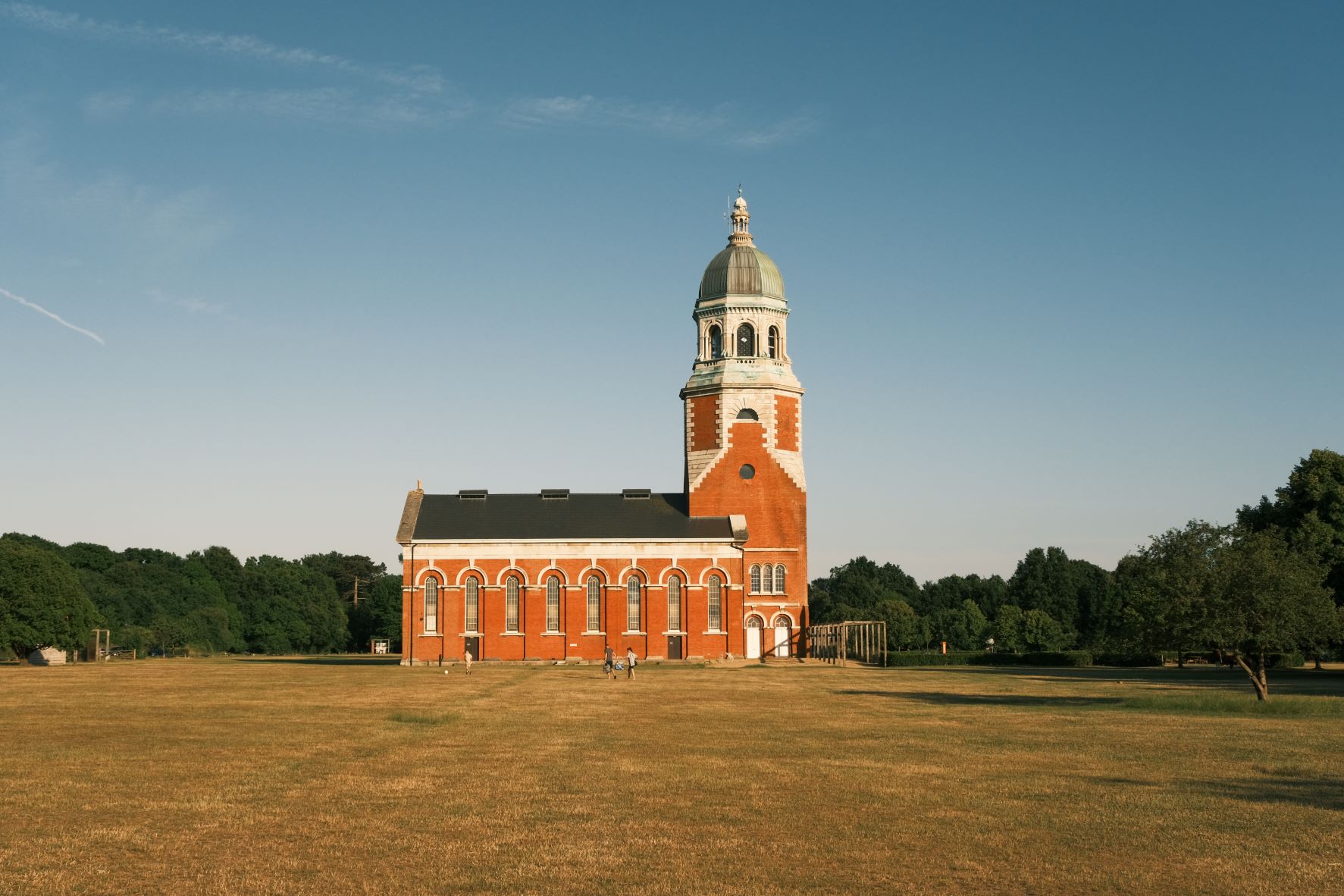
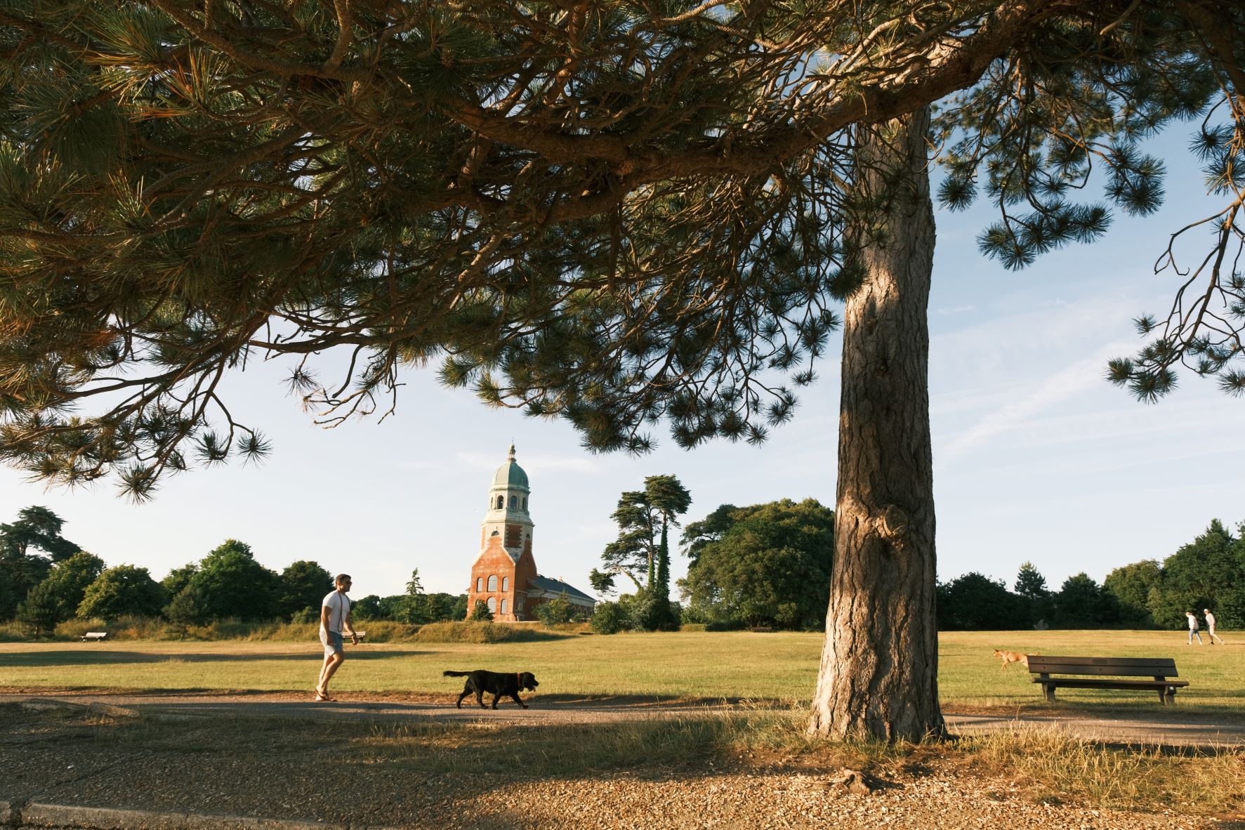
Photos by Fraser Reid

Using the Back in the Day Film Recipe
Each film simulation recipe has its own character and style. These features mean recipes are more suited to certain situations, or when seeking a particular look. Here are the categories that Back in the Day has been tagged with.


Leave a Reply