Warm tone film recipe for Fujifilm X-Trans IV, like the X100V, X-E4, X-S10

Nostalgic Standard
Sometimes, I want to achieve a mellow nostalgic tone in my images, but I prefer not to add the extra styling of Classic Chrome or Classic Negative. This Fujifilm film recipe is for days like that. It has a gently warm retro feel from a creamy colour balance shift, but using the Pro Neg Standard film simulation.
And, just because the mood is warm, it didn’t have to be hazy. So, I also avoided the misty effect seen in many recipes and used a +3 clarity to keep things crisp and clear, and add some additional contrast to the mid tones. This gives a mellow yet sharp recipe, which makes it sound a bit more like a cheese than a photo style, but either way I hope you enjoy the results.
Because of the clarity setting the recipe is compatible with newer Fujifilm X-series cameras, but you can just ignore clarity if you want to try it out on other models.
Nostalgic Standard Film Recipe Settings
| Film Simulation | PRO Neg. Std |
| Grain Effect | Weak, Small |
| Col. Chr. Effect | Weak |
| Col. Chr. Blue | Off |
| White Balance | Auto, +5 Red, ‑5 Blue |
| Dynamic Range | DR200 |
| Highlights | ‑1 |
| Shadows | 1 |
| Colour | ‑3 |
| Sharpness | 1 |
| ISO N.R. | ‑4 |
| Clarity | 3 |
| EV Comp. | +1/3 |
Similar Recipes

More similar recipes, and hundreds more exclusive looks, are available in the Film Recipes App.
Get the Film Recipes App
Settings laid out clearly, with sample photos and similar recipes


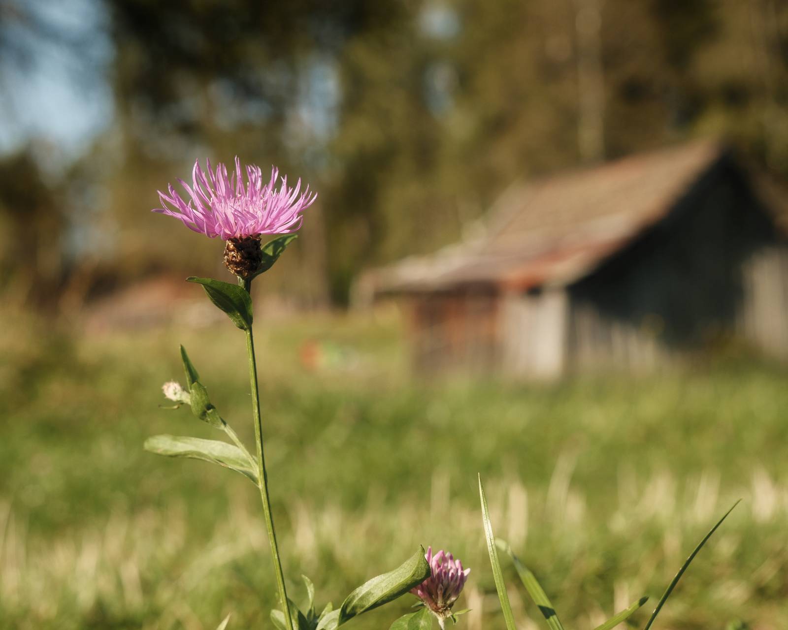
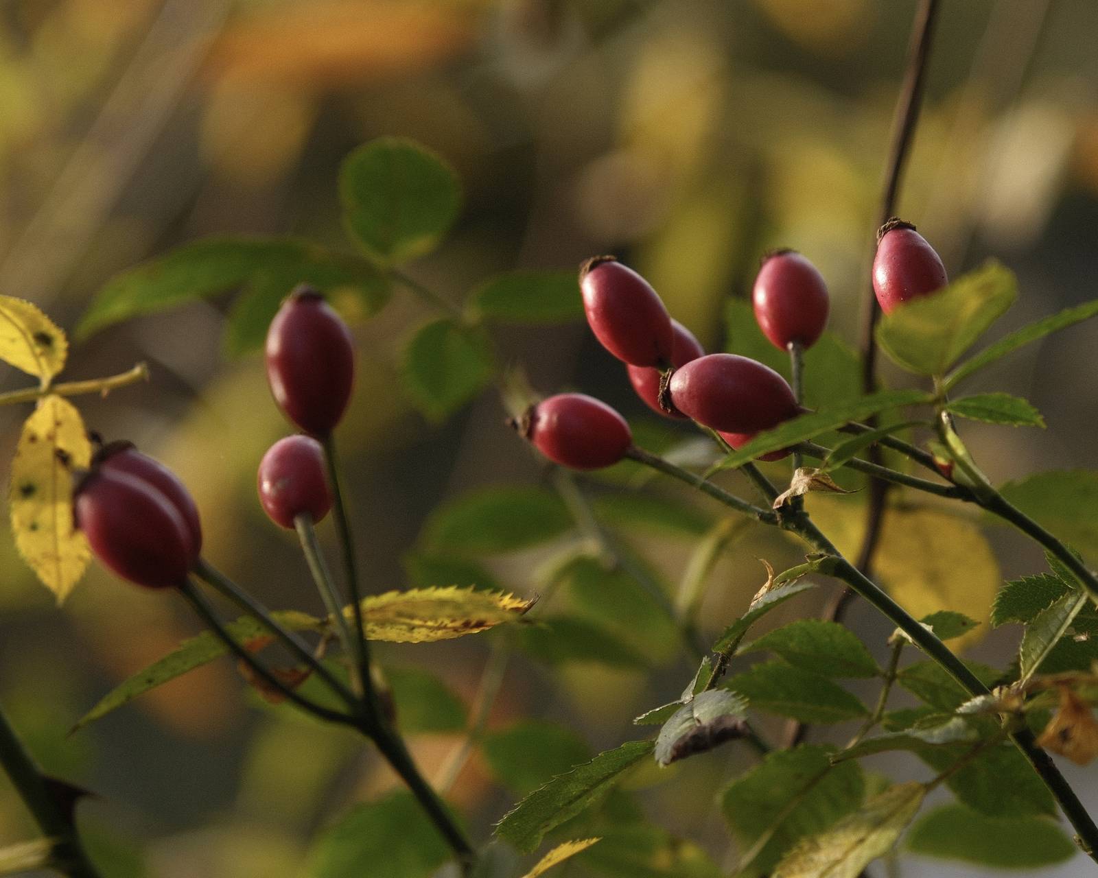
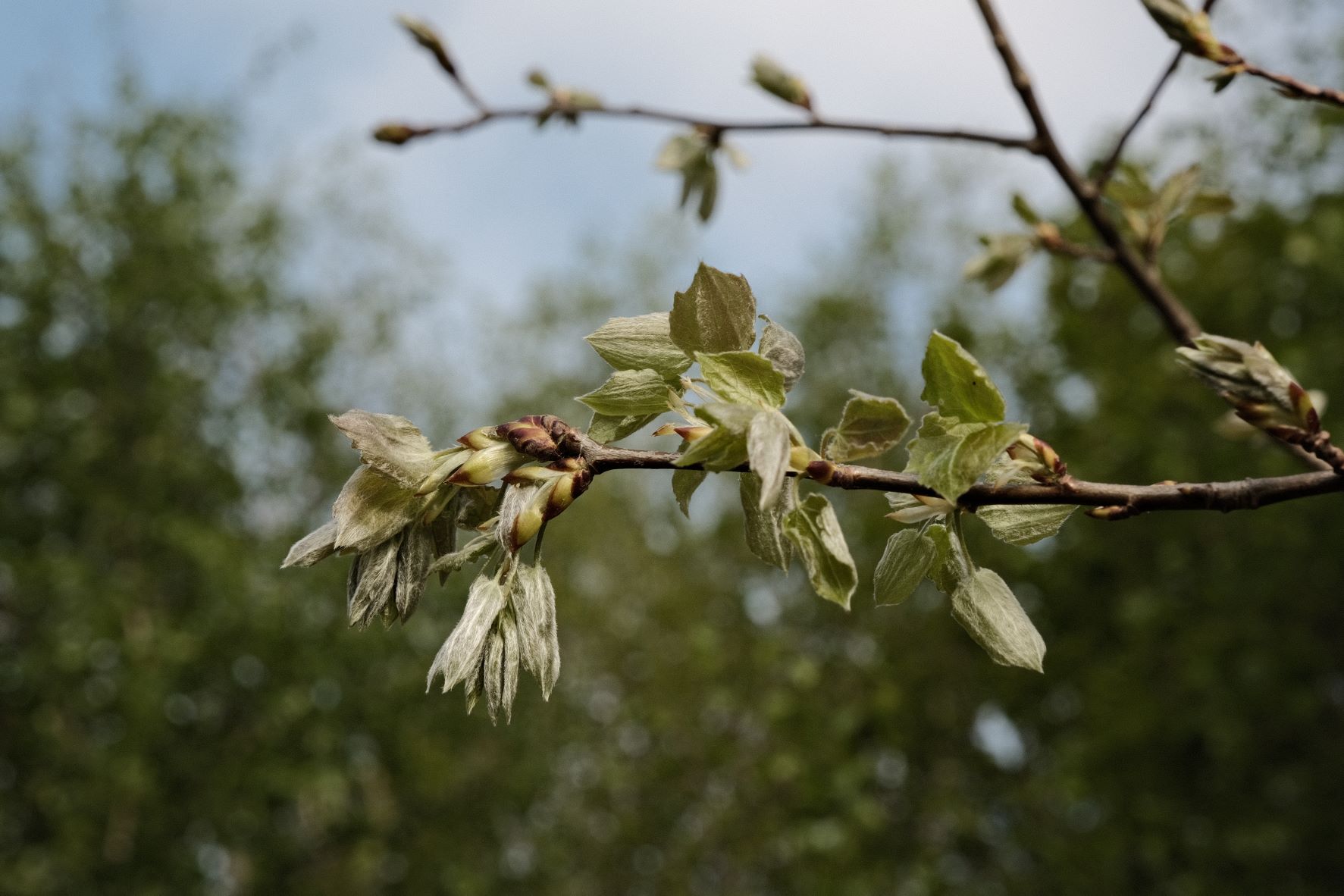
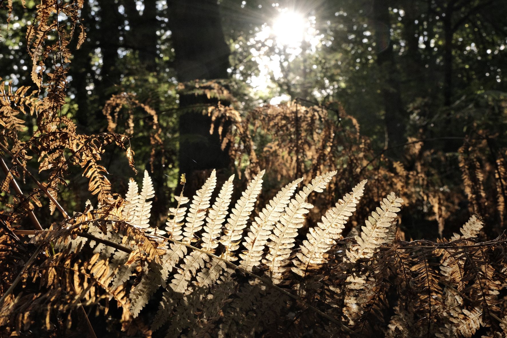
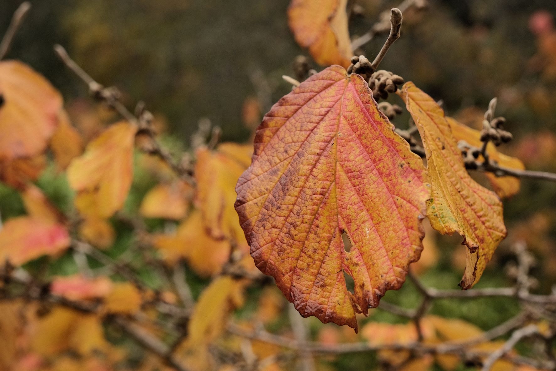
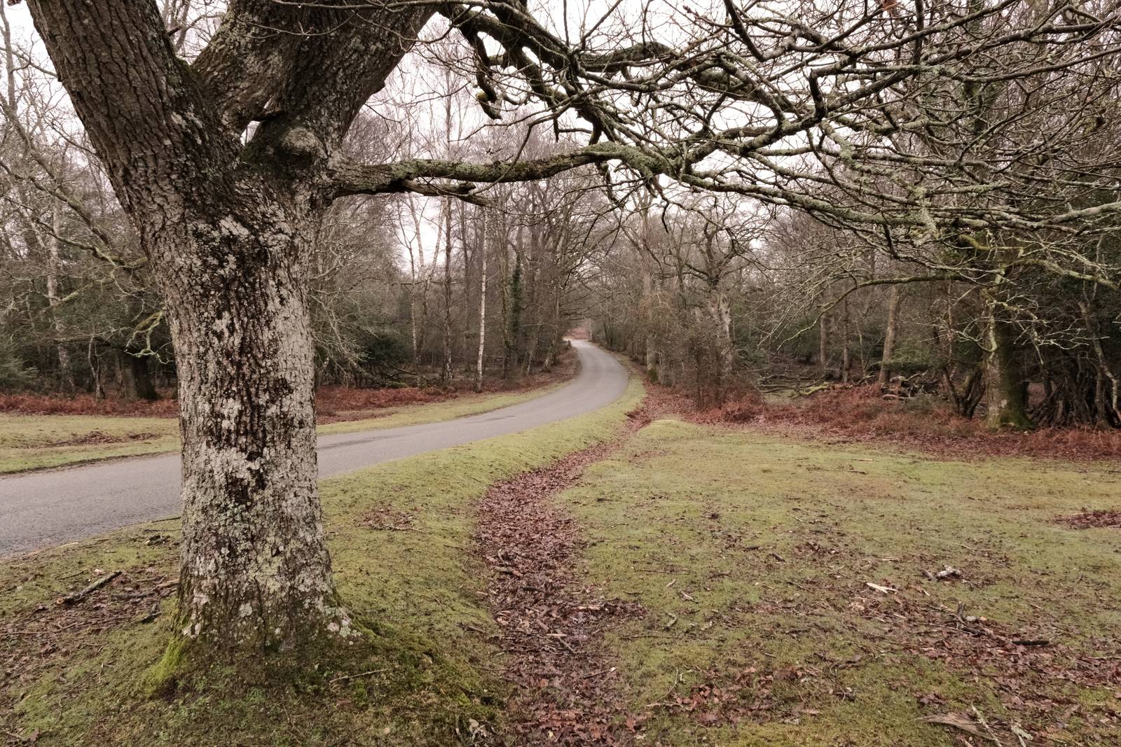
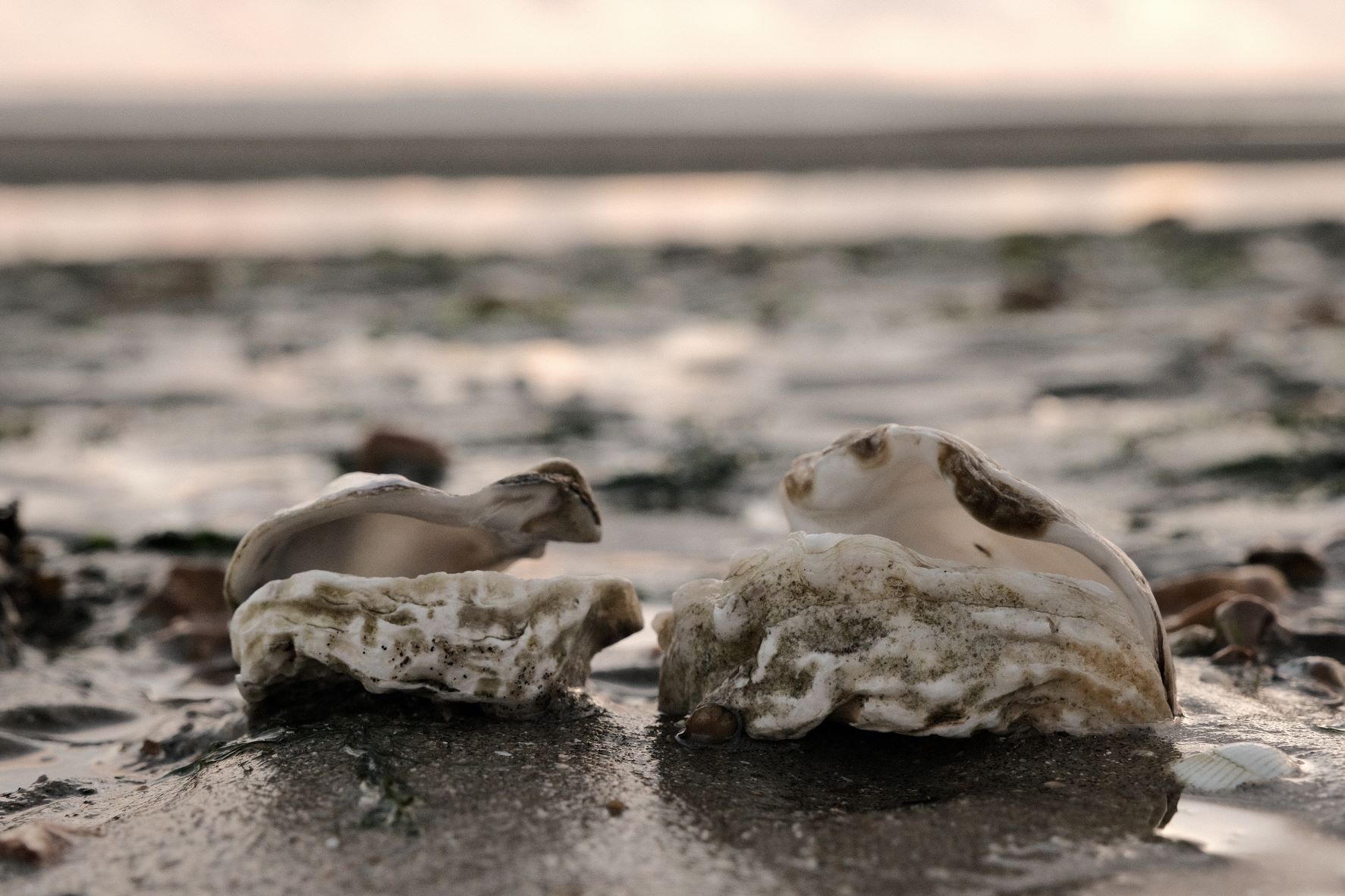
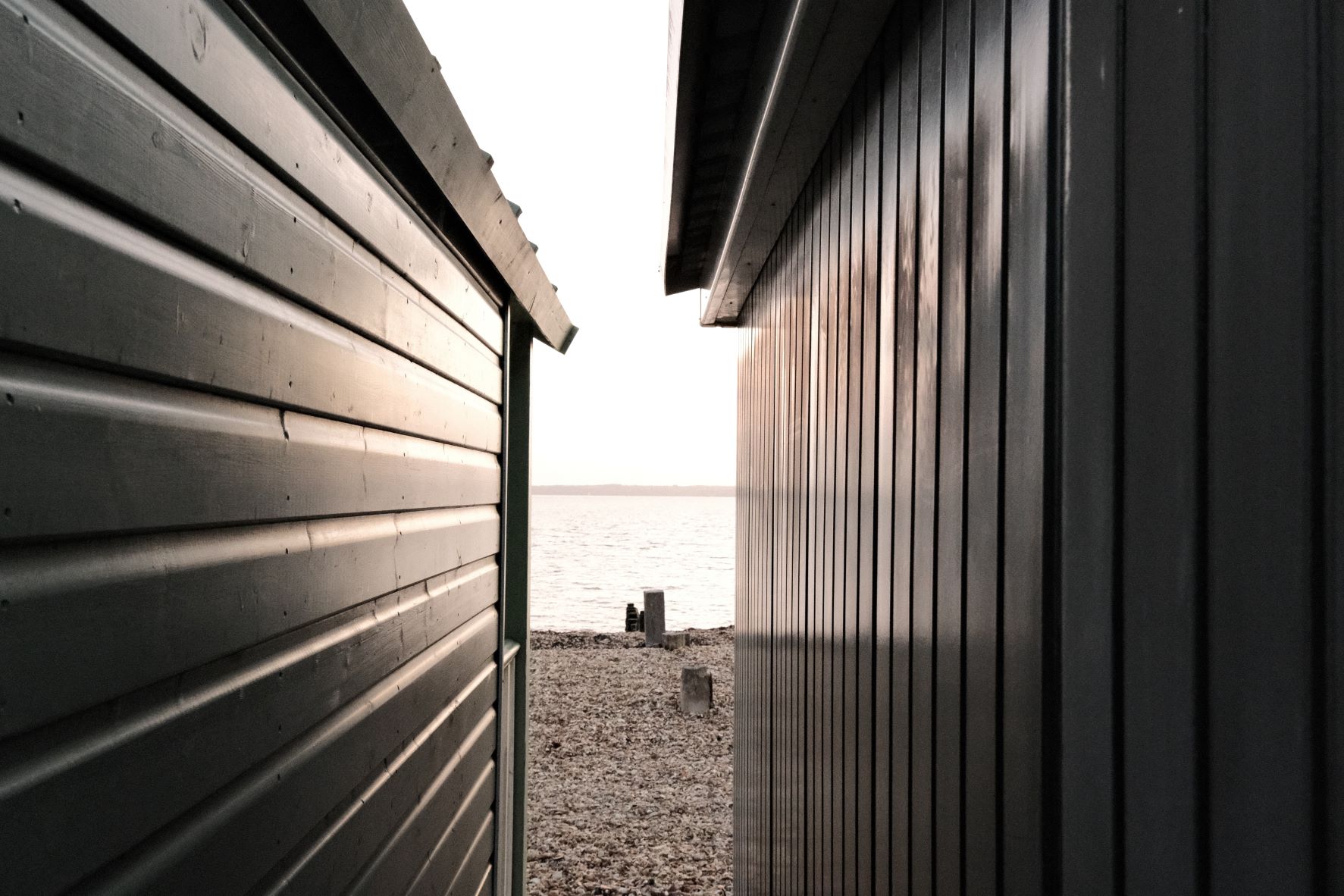
Nostalgic Standard Film Recipe: Sample Photos


Community Photos
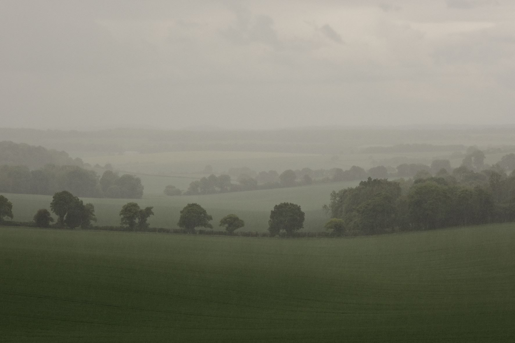
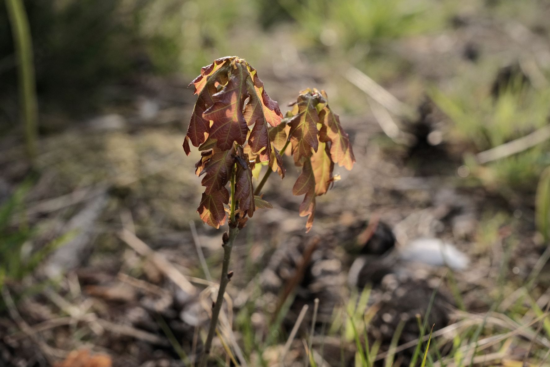
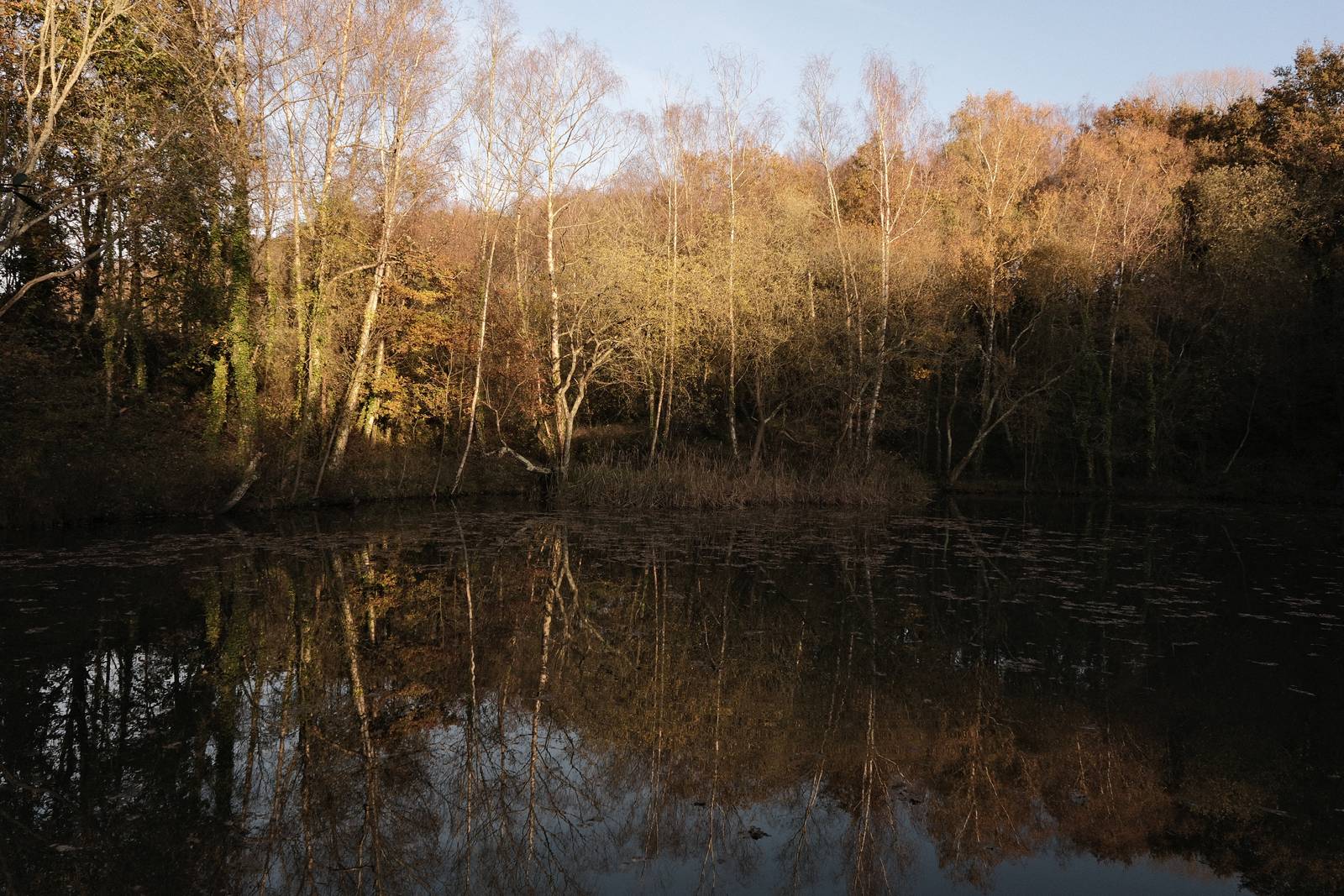
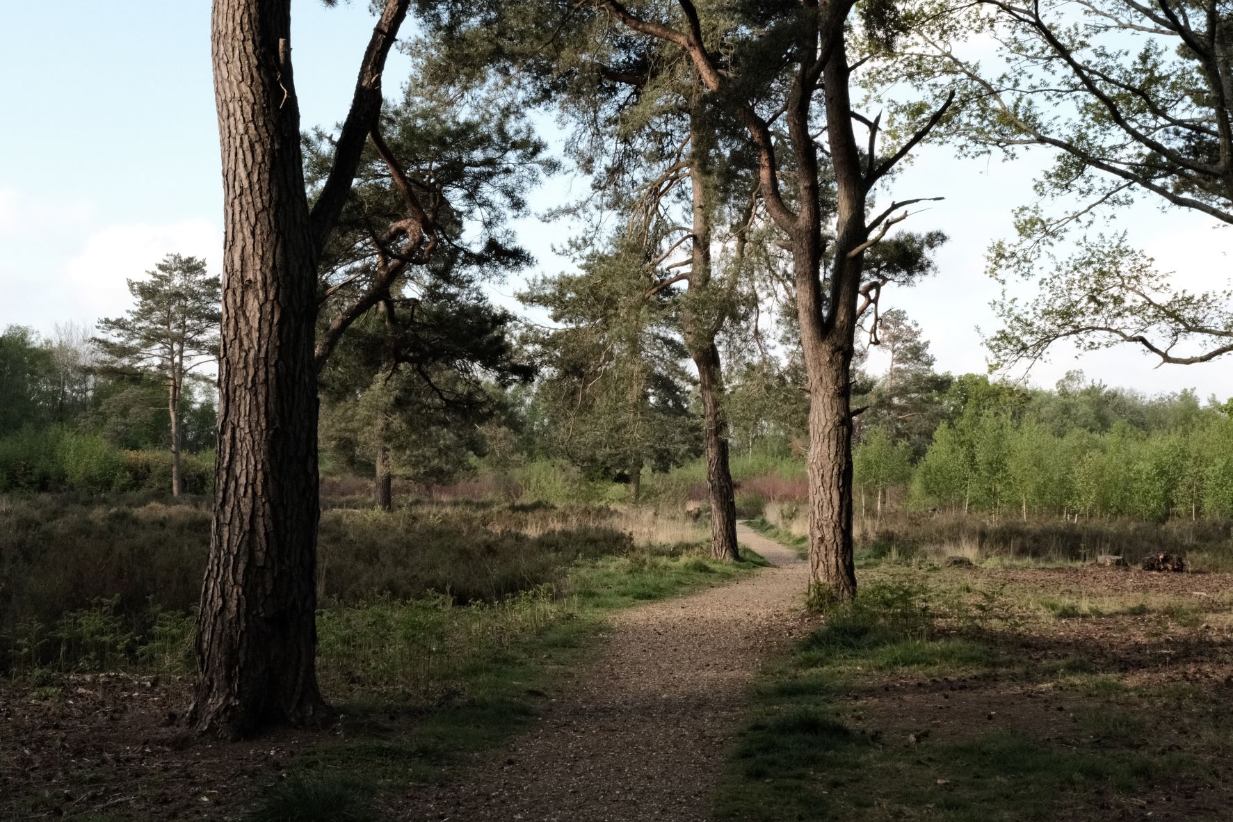
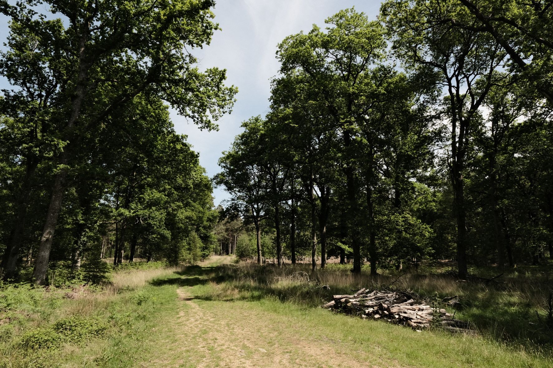
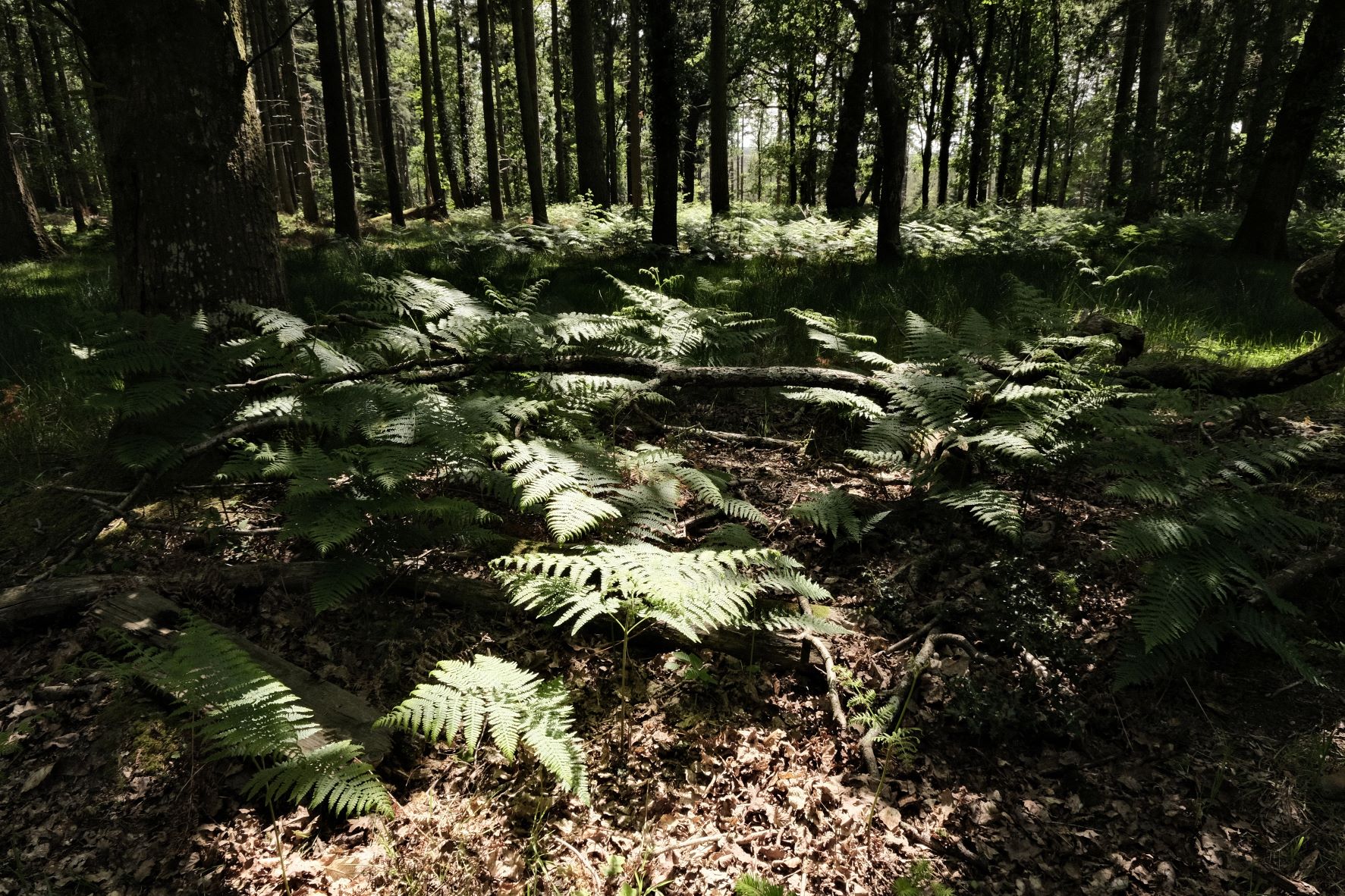
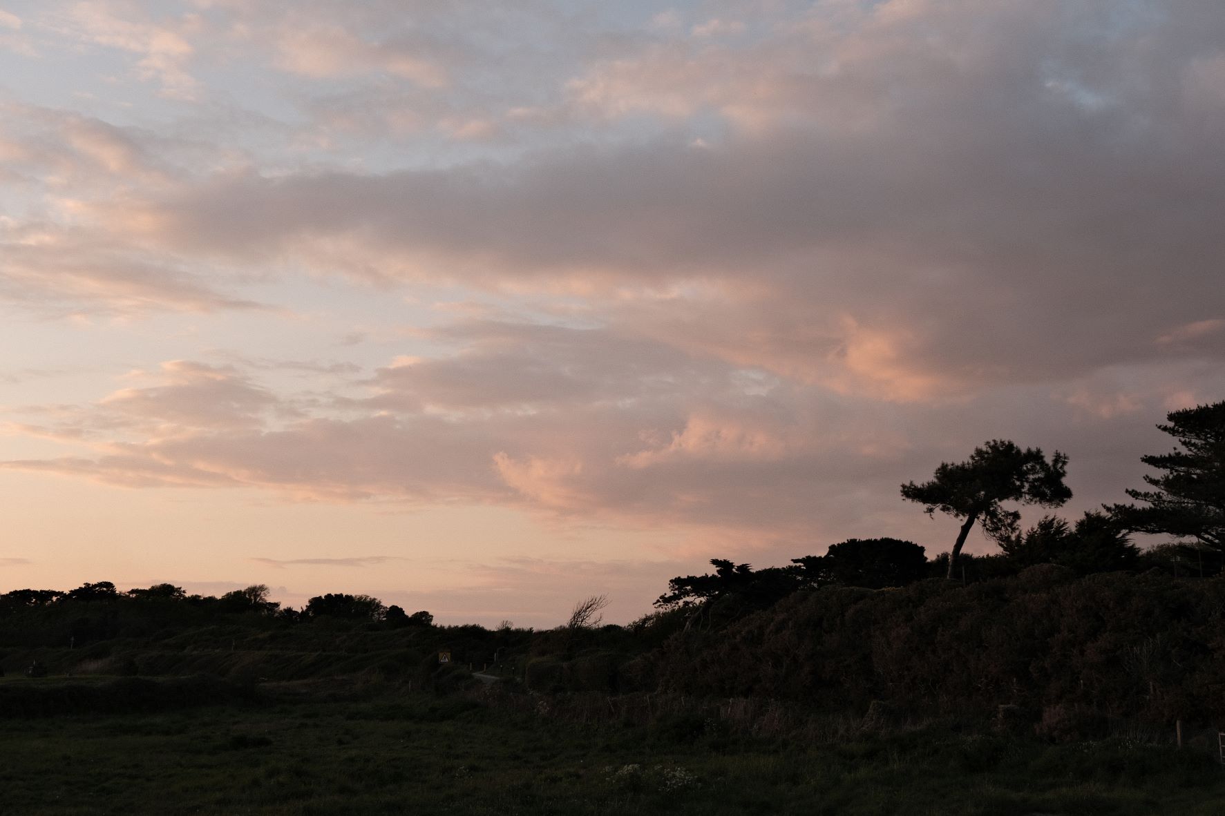
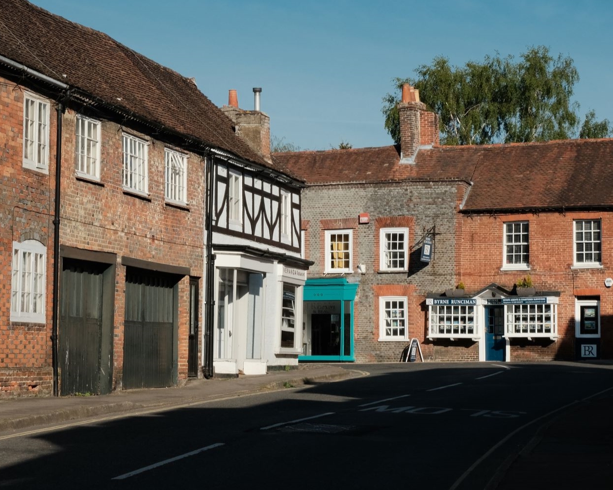
Photos taken with the Nostalgic Standard film recipe by members of the Film Recipes community.
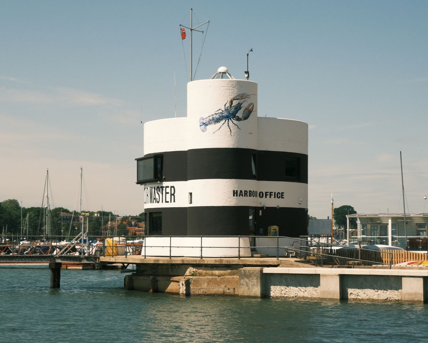
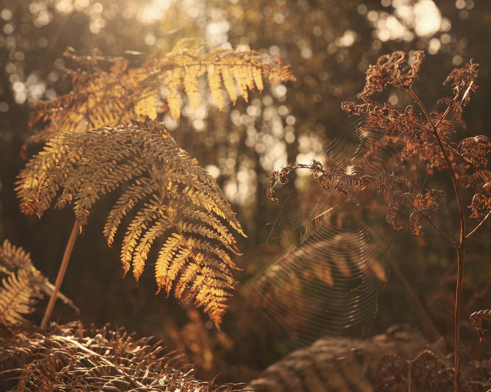
Photos by Alex Tenhave


Using the Nostalgic Standard Film Recipe
Each film simulation recipe has its own character and style. These features mean recipes are more suited to certain situations, or when seeking a particular look. Here are the categories that Nostalgic Standard has been tagged with.


Leave a Reply